Usabilla's feedback form
Background
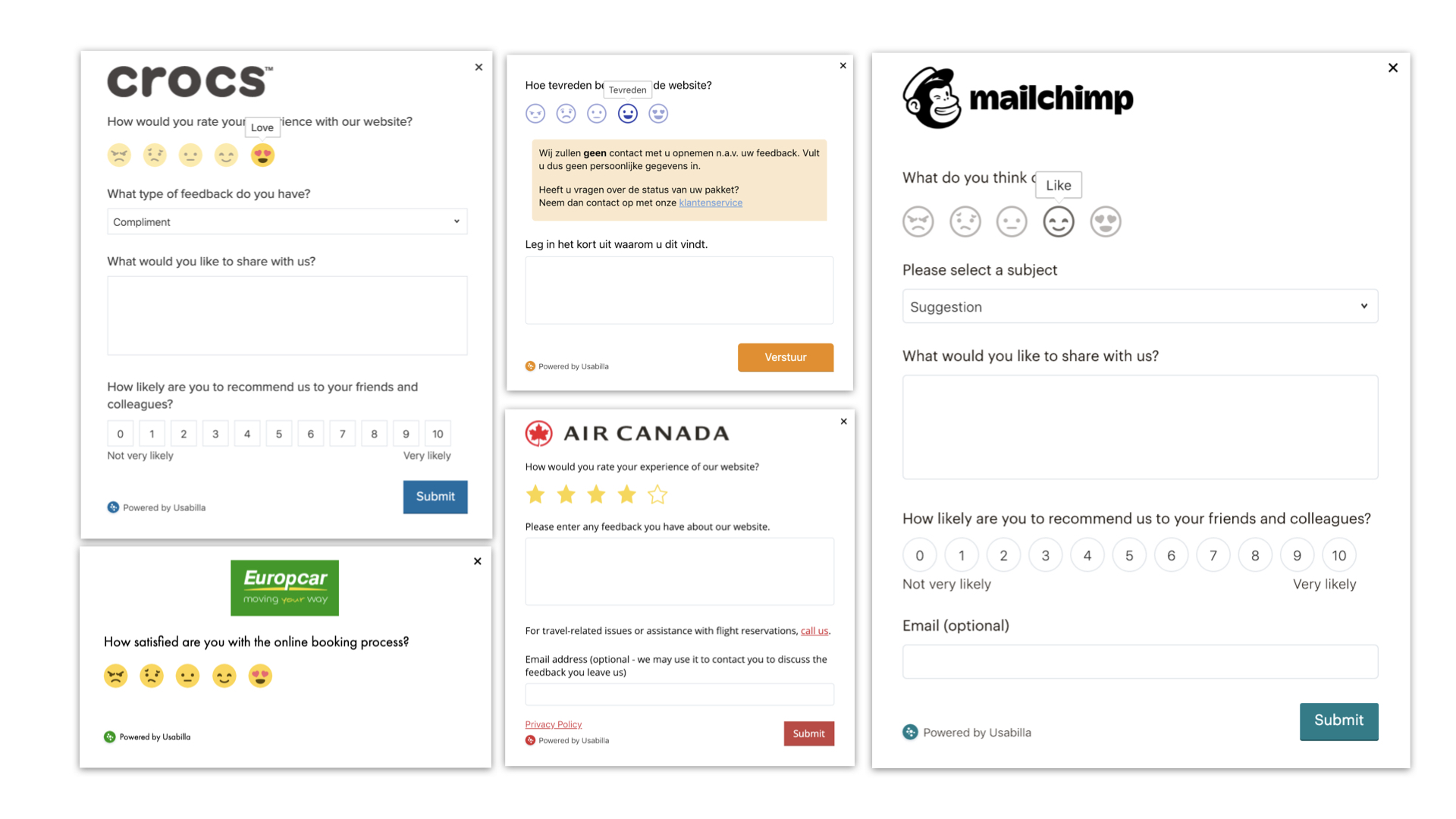
Usabilla allows our customers to collect feedback across multiple channels. Previously, the form’s design varied across the channels (email, web, web, web, and mobile). The design of these forms was outdated and very hard to customize to our customer’s needs.
The task was to create a fresh, unified new style for the Usabilla feedback form. Fit the different brands but still be Usabilla, stay consistent across four platforms, be accessible, re-design eleven different form components with ratios, not pixels to make them scaleable, completely responsive, support all different browsers, and RTL.
The task was to create a fresh, unified new style for the Usabilla feedback form. Fit the different brands but still be Usabilla, stay consistent across four platforms, be accessible, re-design eleven different form components with ratios, not pixels to make them scaleable, completely responsive, support all different browsers, and RTL.
My design guidelines - It needs to be clear and straightforward, avoiding unnecessary movements. I aimed to make the process of leaving feedback, fun and playful but not silly. The behavior should feel human, the movements aligned with the laws of gravity and that all the interactions have the same logic. My main objective in using micro-interactions was to guide the user to the next step and to show the relationship between elements.
Read more >>
Read more >>

Responsiveness
Usabilla’s software is used globally by over 450 brands. That means our product has to work with very different browser types or digital experiences. Think Mozilla Firefox, Google Chrome, Edge, Internet Explorer, Safari, and more. The form has to be extremely responsive to different digital environments. As a designer, it’s a welcome challenge as it presents a new set of digital principles to follow.
Usabilla’s software is used globally by over 450 brands. That means our product has to work with very different browser types or digital experiences. Think Mozilla Firefox, Google Chrome, Edge, Internet Explorer, Safari, and more. The form has to be extremely responsive to different digital environments. As a designer, it’s a welcome challenge as it presents a new set of digital principles to follow.
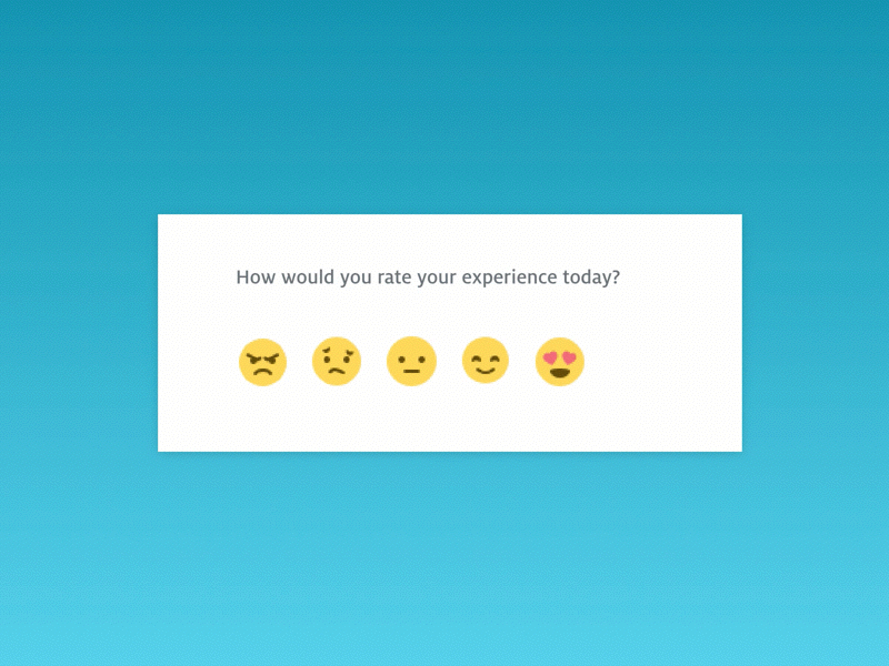
I browsed through the countless emojis out there and analyzed the range of emotions users feel about digital experiences to find the most representative smileys.
Then, I sketched different smiley options and sent out a randomized survey asking all sorts of users which smiley best represented which emotion, and which emotion best represented unique digital experiences. For example, does a bug at checkout make you sad, angry, or frustrated? Which smiley best describes that feeling?
We made sure the smileys were also globally understood as we operate in 139 countries. What looks like “angry” for one culture might be completely different in another. Once we gathered feedback on the new feedback form smileys, we were ready to tackle each challenge in unifying the design.
Style One of our design principles is playful, which is a huge part of the Usabilla brand and personality. I wanted to keep that by using micro-interactions and animation.
To achieve the perfect balance between too much animation (there is such a thing, and it can be very disruptive!) and a bland, unengaging amount of animation, I defined some guidelines and personality to the animation behavior.
The process of giving feedback should be as natural as a flow of conversation. It needs to be clear and straightforward, avoiding unnecessary movements. I aimed to make the process of leaving feedback, fun and playful but not silly. The behavior should feel human, the movements aligned with gravity laws, and all the interactions made with the same logic.
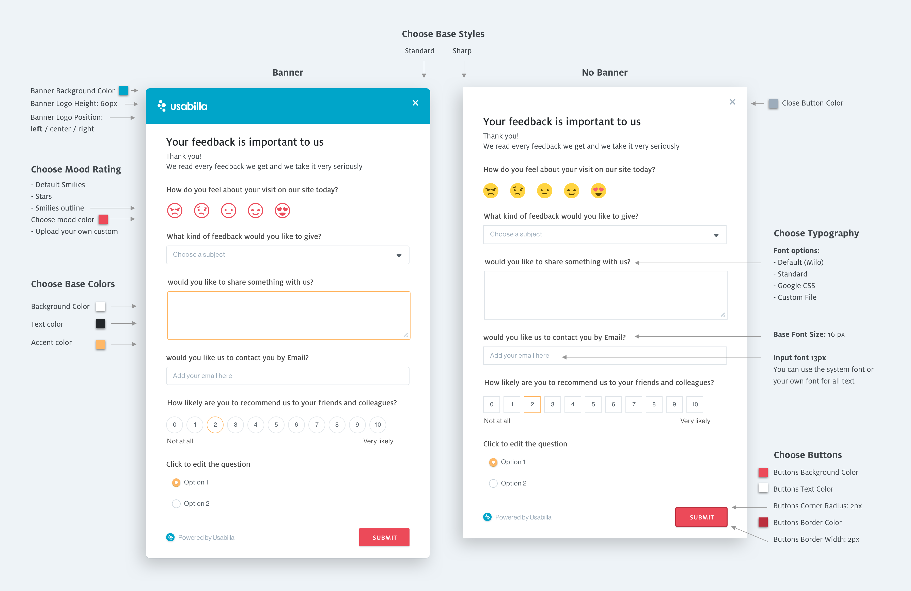
Customizable
Design principles for color, font, and style.
Colors - The customer can choose different colors. I needed to have some base colors for the elements like different shades of gray that could be used for the borders and shadows that would work with various background colors.
Fonts & Sizing - To allow customers to choose their font size, I used an EM ratio that would keep a consistent relationship between the titles and the text based on their preferred base size. The input font with a fixed size to optimize readability for the end-user – that was something we couldn’t compromise on.