Customized and personalized hormonal fertility report ,Grip Report
March 2021 - November 2021 Design Lead at Grip - responsible for product & marketing design.
March 2021 - November 2021
Design Lead at Grip - responsible for product & marketing design.
Roles and responsibilities
- Concept strategy & vision, collaborating with the CPO and Engineering lead on research, scoping & MVP.
- UX flow and wireframes, data visualization and UX patterns.
- User interviews, customer demos, and user testing.
-
Creating a UI design system, detailing the components and reviewing implementation.
- Continues development of concepts and improvements based on user feedback.
Grip offers people with ovaries a view on their personal hormonal & fertility health based on an at-home blood test.
The report is a doctor-reviewed, personal hormone risk profile. That tells our customers more about their fertility, and if there are any red flags.
Checkout my real Grip report
Product strategy
Background
The initial PDF report we used at Grip was designed by the founders to deliver quick insights to the customers based on their lab results. The PDF report was not personalized to the customer’s unique goal, was not scalable for the operation team, connected to a manual excel datasheet, and missing a design touch.
Create a personalized report per persona and their goal:
Create different template for different results:
The initial PDF report we used at Grip was designed by the founders to deliver quick insights to the customers based on their lab results. The PDF report was not personalized to the customer’s unique goal, was not scalable for the operation team, connected to a manual excel datasheet, and missing a design touch.
Create a personalized report per persona and their goal:
- Anne Marie (29-35, just curious)
- Bete (under 28, worries about hormonal imbalances)
- Ling (average age 32, thinking about freezing her eggs)
- Marjolien (average age 30, currently trying to conceive)
- Kacy (over 35, just curious)
Create different template for different results:
- All normal
- Risk of Polycystic Ovarian Syndrome
- High Testosterone
- Slow or fast thyroid
- Risk of blocked fallopian tubes
- Low egg count - risk for early menopause
Project goals:
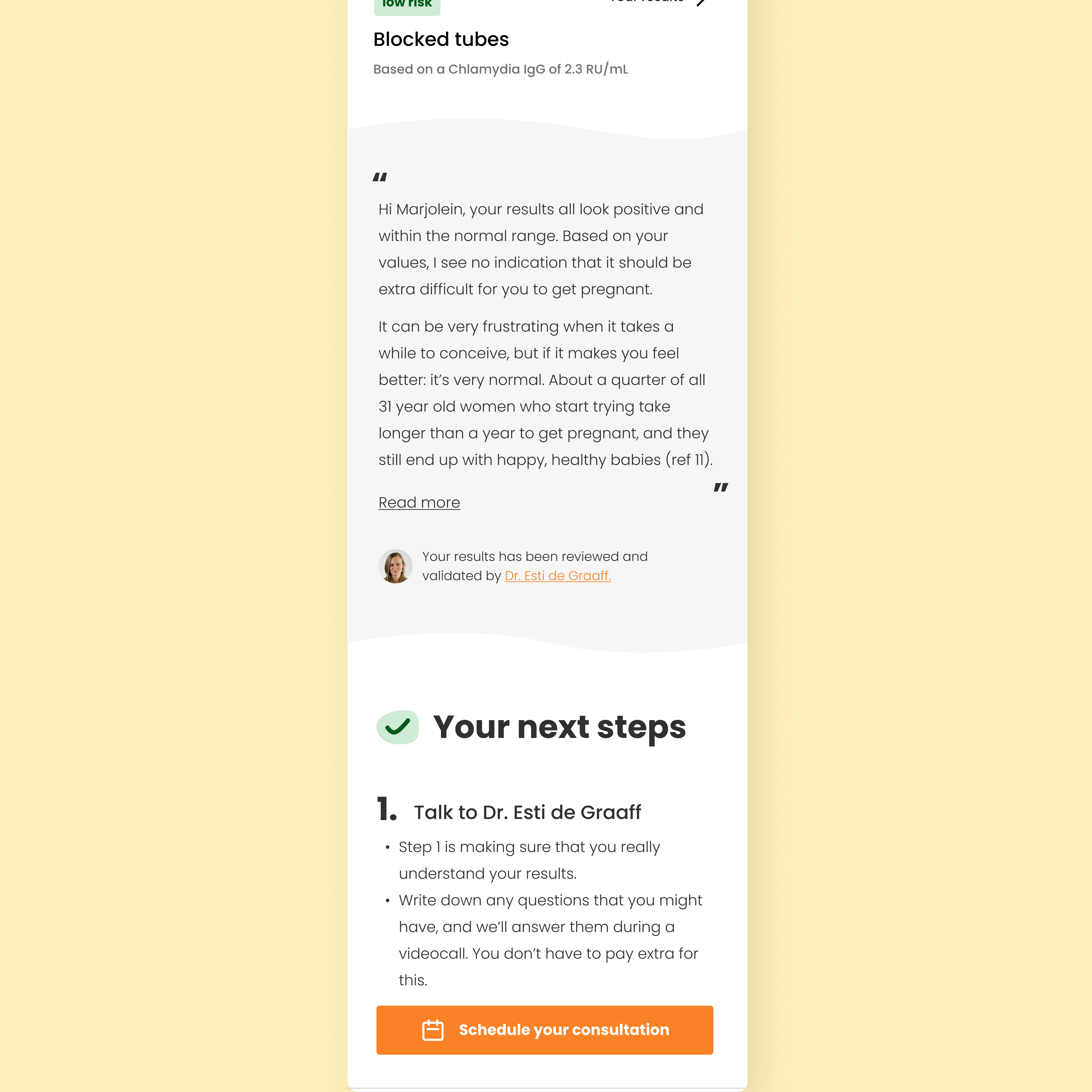
1. Increase customer satisfaction with Grip, by making the report more actionable, personal, meet expectations, positive and trustworthy. (based on customer feedback & NPS drivers )
2. Create an automated process that will allow speeding the operations of non-normal reports and personal reports.
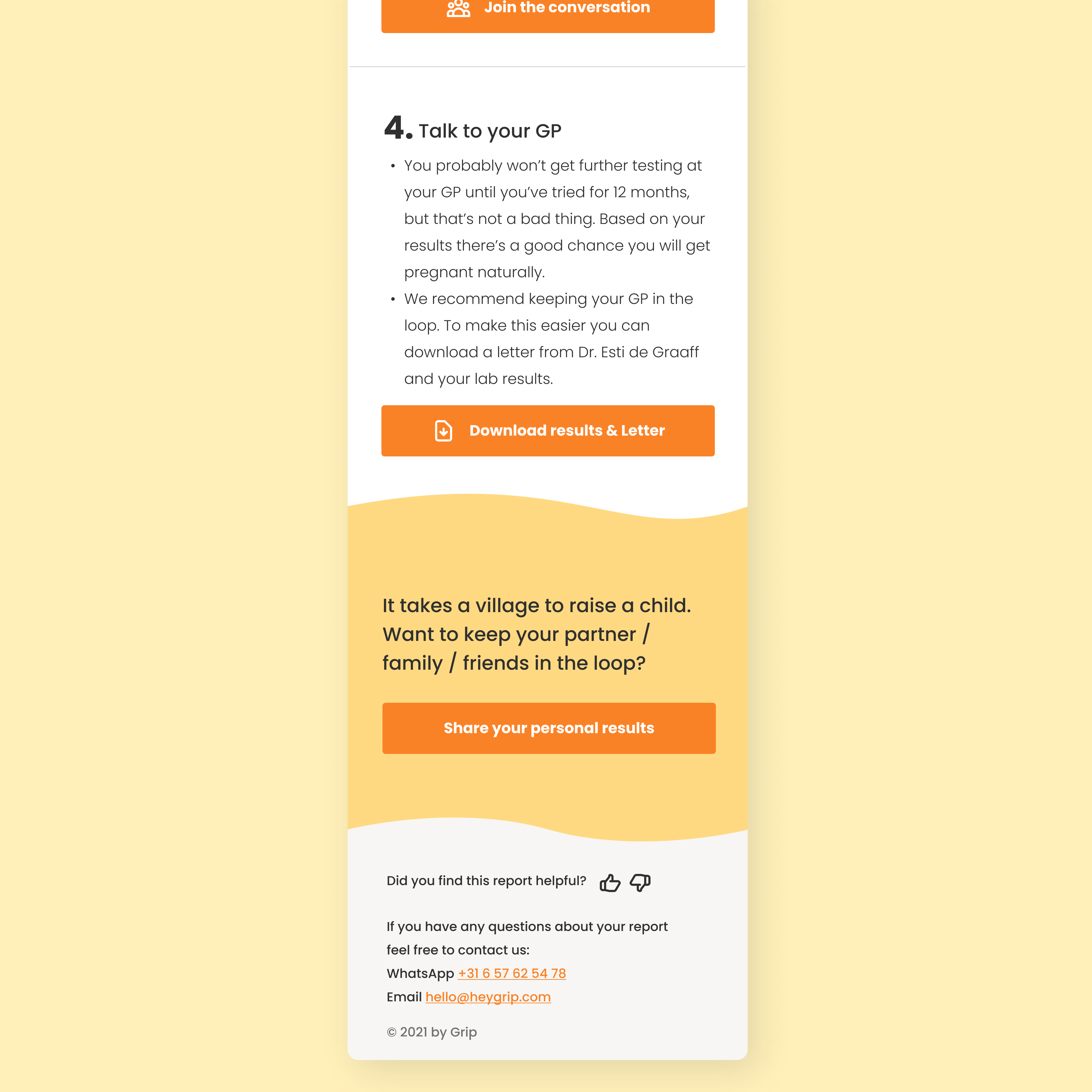
3. Create a scalable one-stop-shop for all grip related actions:
1. Increase customer satisfaction with Grip, by making the report more actionable, personal, meet expectations, positive and trustworthy. (based on customer feedback & NPS drivers )
2. Create an automated process that will allow speeding the operations of non-normal reports and personal reports.
3. Create a scalable one-stop-shop for all grip related actions:
- book consultation
- download a letter to the GP & lab results
- learn about fertility
- connect to the community (via Slack)
- refer a friend
- and create infrastructure for future product development
What problem are we trying to solve?
Our customers want to learn more about their bodies, plan for the future, and take actions based on their own personal status and goals.
Research
Grip’s NPS Drivers
🧡 great experience vs 💔 bad experience
Actionable.
🧡 I made a meaningful life change based on my Grip results.
💔 my results were bad but there's nothing I can do about them and now I worry.
Personal.
🧡 Grip sees me as an individual and knows my exact situation, I have one point of contact (a doctor) who supports me.
💔 Grip feels automated and like a machine, I get passed around.
Meets expectations.
🧡 I wanted to know x and that's what I learned.
💔 I wanted to know x but I learned y and now I feel like I wasted 159 euros and am back to square 1.
Positive.
🧡 I feel supported and in control
💔 I feel alone, scared, and unsure of what to do next.
Trusted by others.
🧡 I know what to do next and have received a positive response from my GP/partner/family/egg freezing clinic.
💔 I went to my GP/partner/familiy/clinic but they told me Grip is a scam and now I feel like an idiot.
With these guiding principles in mind, we created over 80 personalized templates based on the customer’s unique goals, results, and action plan.
Design
My main challenges:
When designing for users who need education about the topic and their bodies, the challenge is to build trust and credibility while balancing it with user-friendliness and delight in every touchpoint.
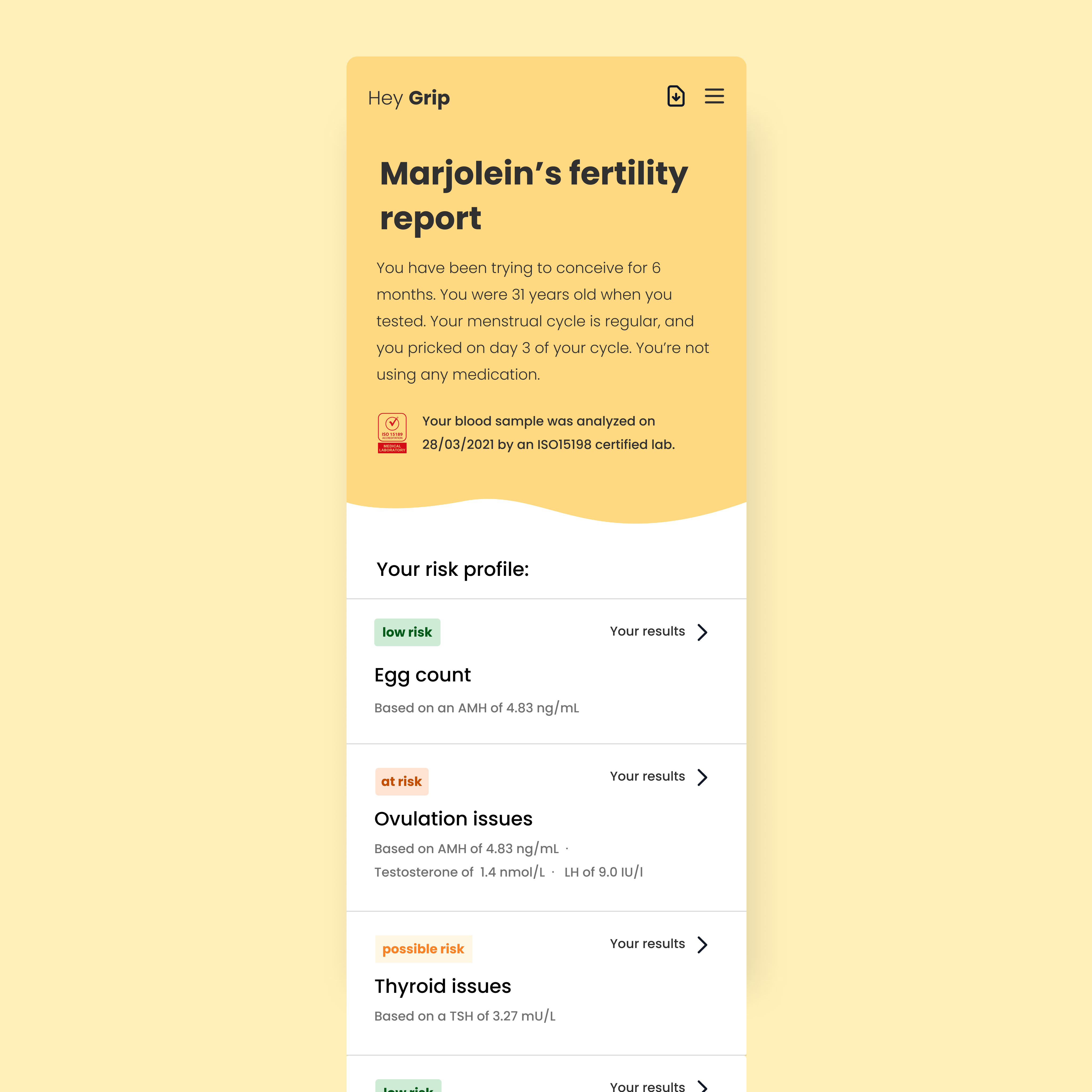
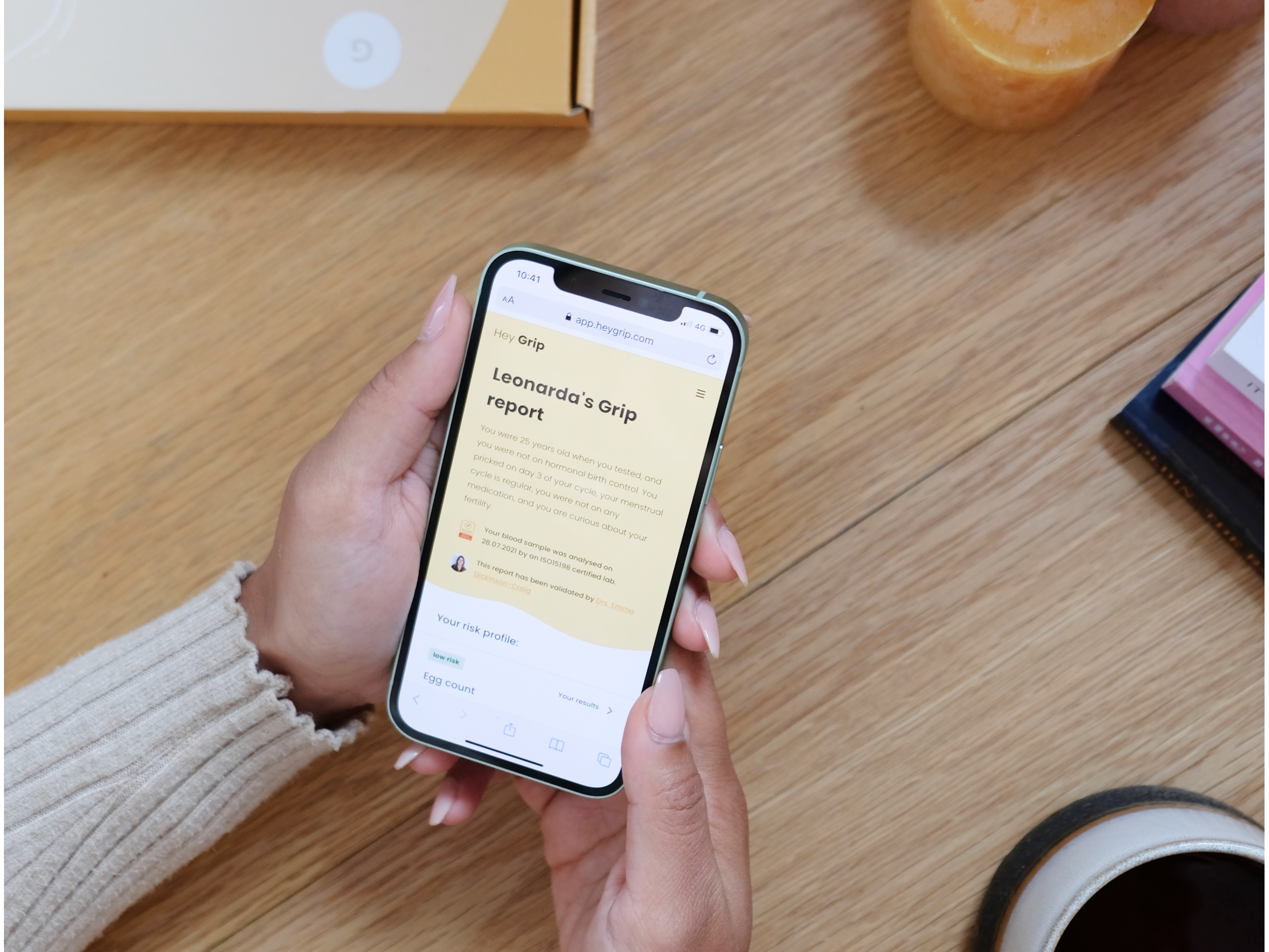
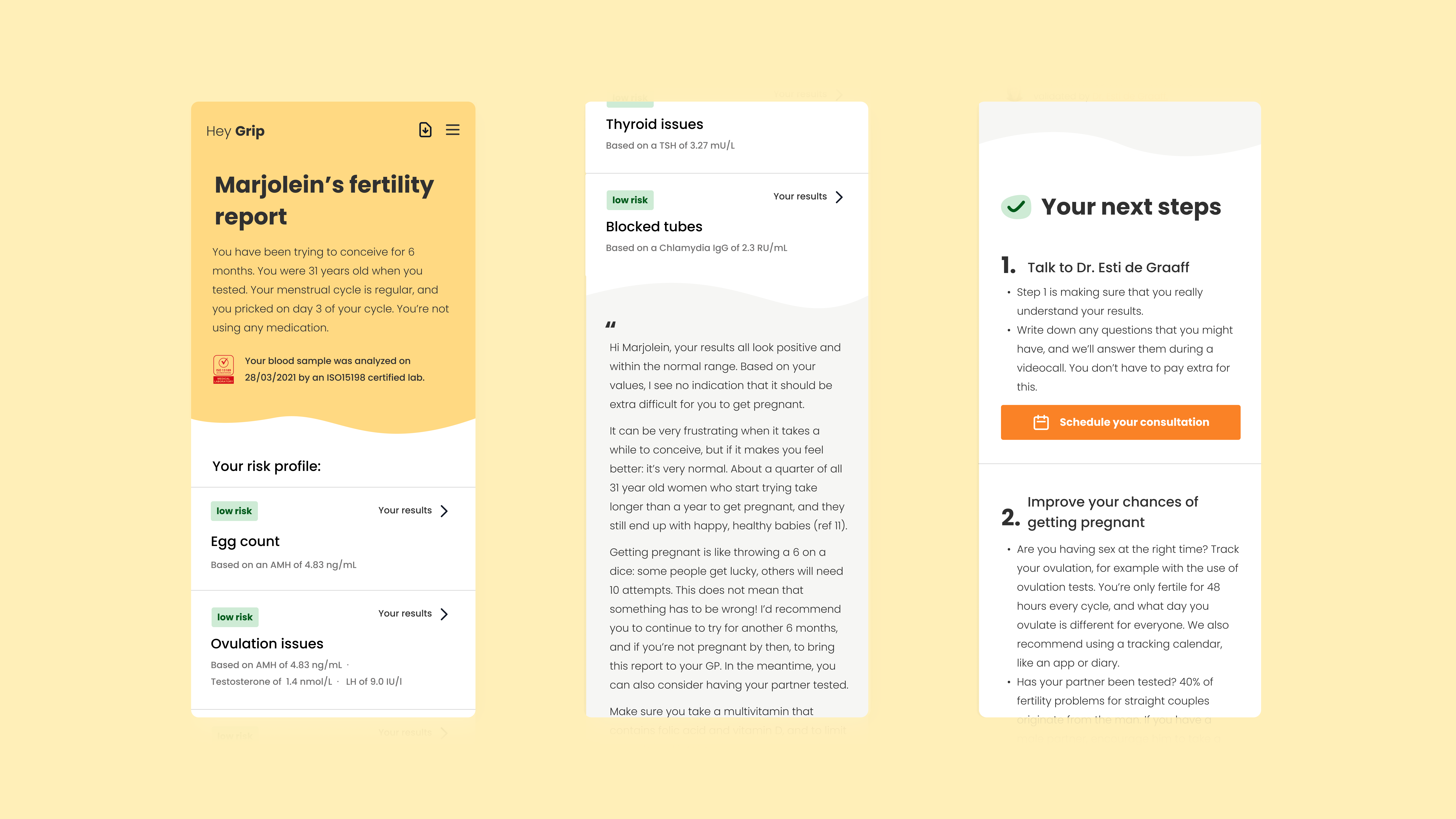
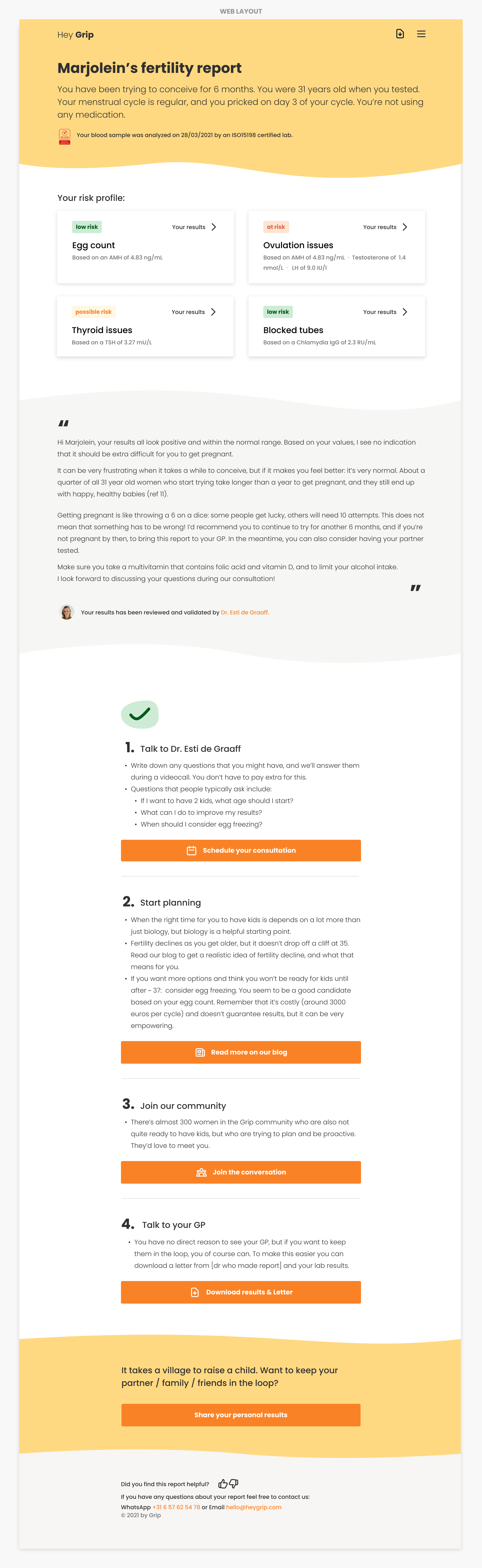
Overview page
When a user logs in for the first time, they want to quickly scan the results and actions, so they can get the immediate reassurance they were looking for.
Actions:
- Scan results and drill dow
- Read the personalized doctors not
- Read and take next actions such as scheduling a doctor appointment, learning more, joining the community, or sharing the results with their GP/OBGYN/Friends & Family.
Checkout my real Grip report
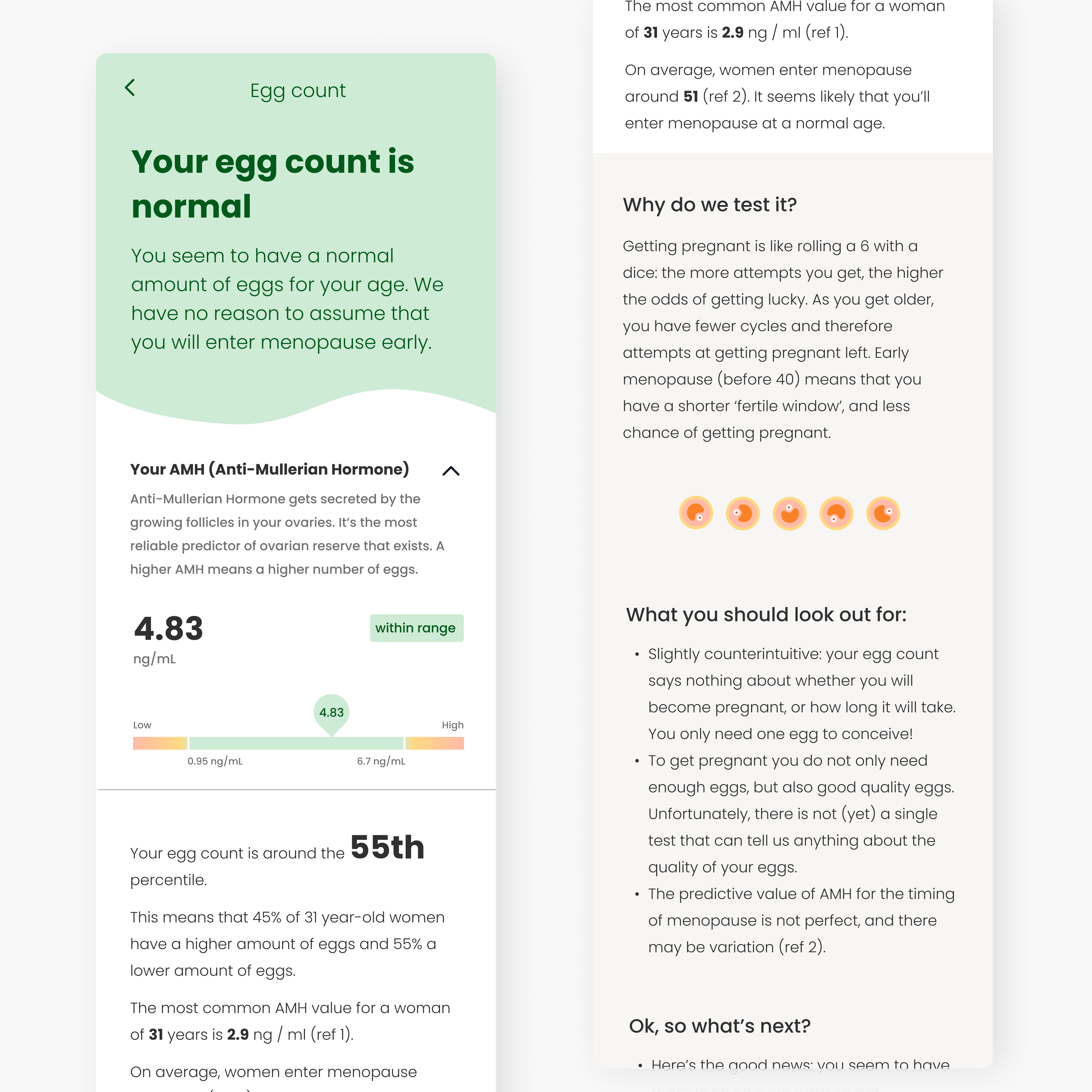
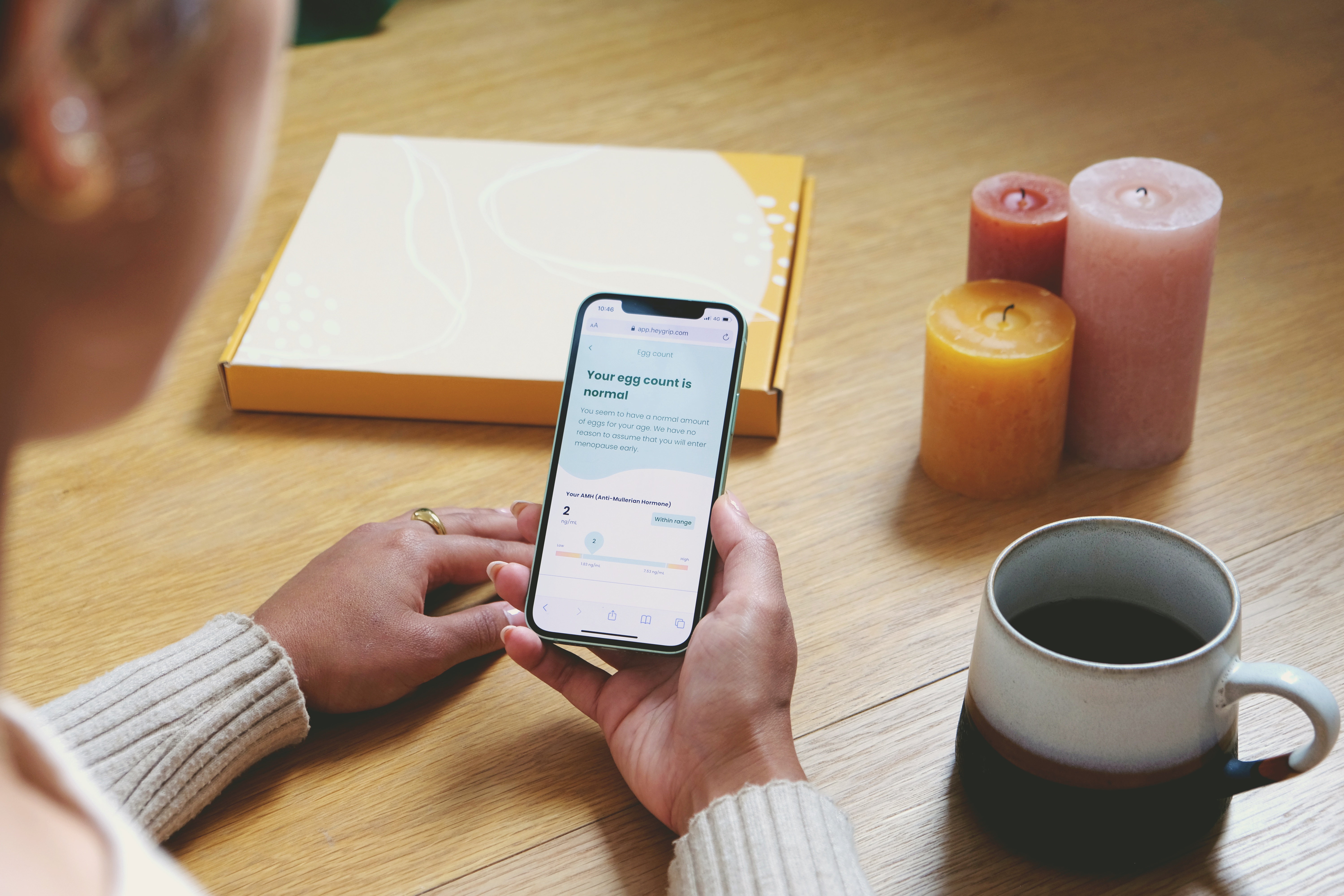
Inner pages
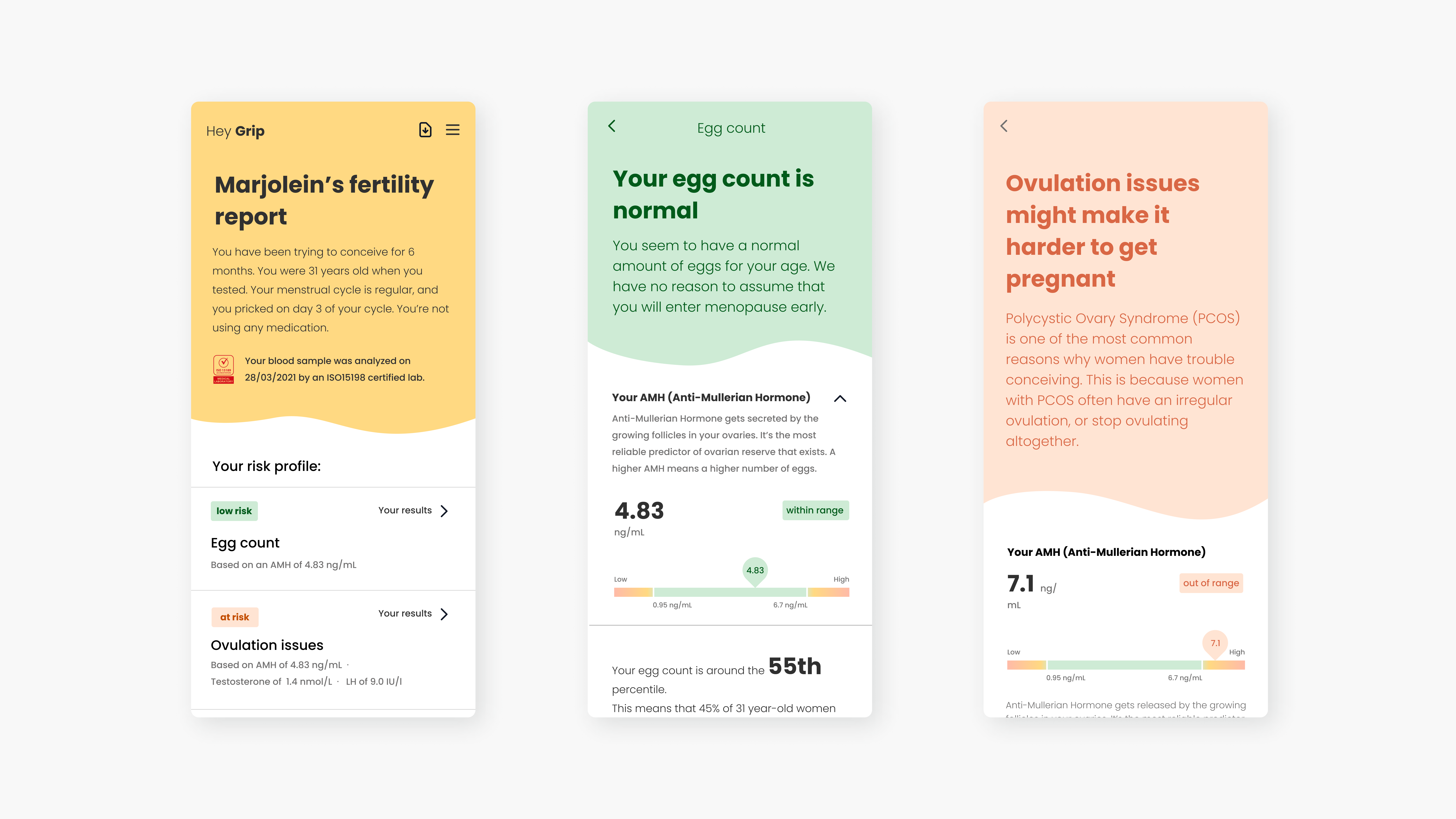
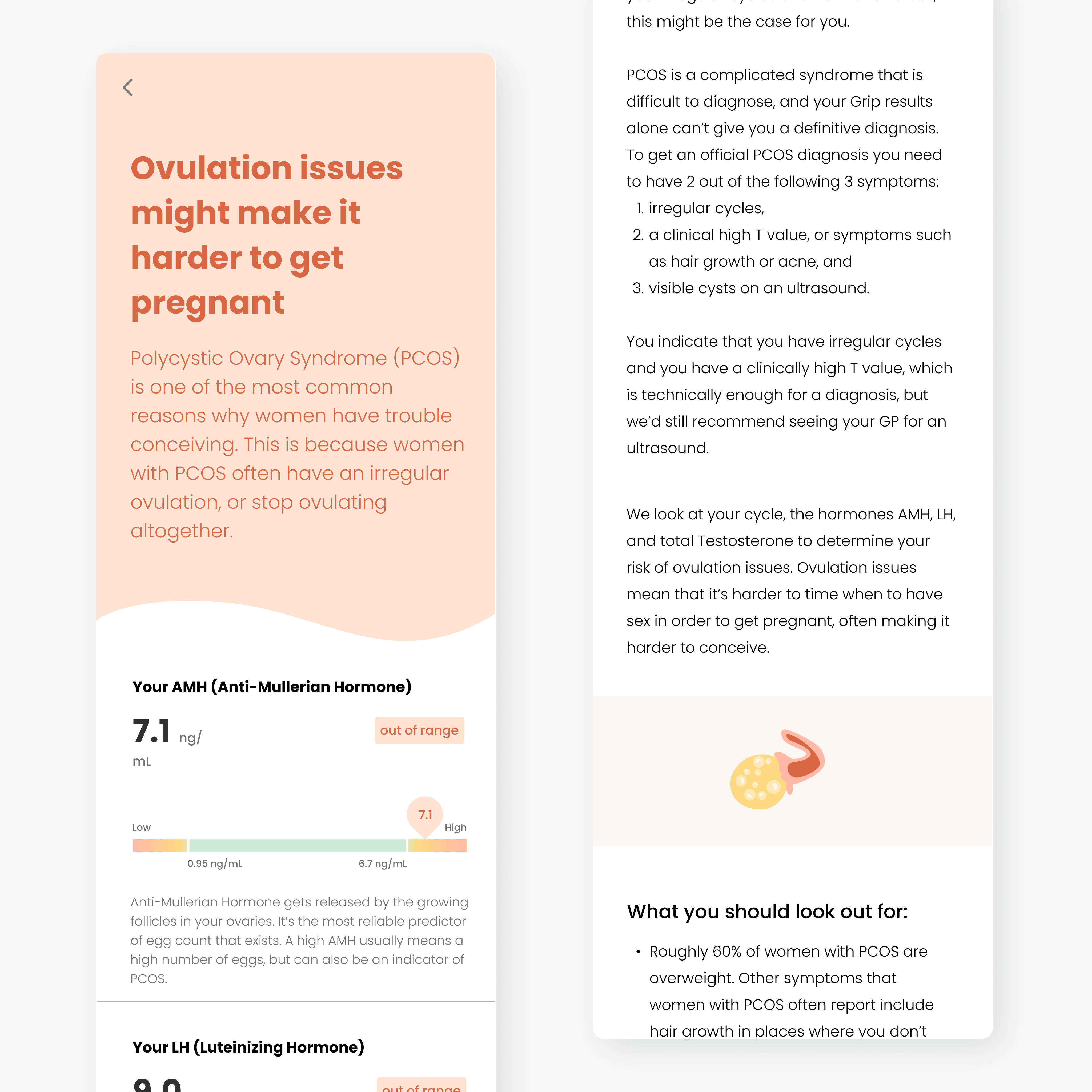
When a user drills down to see the result per hormone, they want to understand whether their results are within normal range, so they know what actions they could take.Includes:
- Results summary in the header with color-coding
- Explanation about the hormone and the science
- Graph showing their results in or out of the normal range
- Explanation on what their personal results mean
- Why we test this and what they can do with the results based on their personal goal
Checkout my real Grip report
Iterations
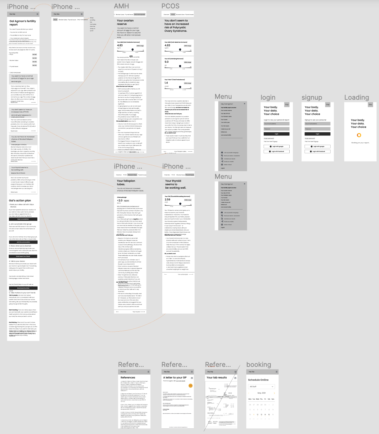
Phase 1: Beta test with all normal results
- create a low fidelity wireframes for internal testing
- create a high fidelity prototype for user feedback
- conduct 8 user interviews
🧡 Postive feeback
- The wave shapes and the colors and illustrations
- The summery looks formal and reliable with the certification and the doctor.
- The checklist and lifestyle content and the recommendations
- The content overal, very informative, not overwhelming
- Love the real results and the letter from the doctor
- Likes the section separation and structure.
🤓 Improvments
- Copy: Educate them more, explanation about the hormones and terminology. Could be more relevant and personal.
- UX: Add navigation to the overview page, add block tubes graph, make the lab more visible, make reference page a model.
💡We initially planed to have the report per persona & per results, that led to a lot of duplications in the customization, minor changes and lots of work. We re-analyzed the data and landed on 3 types of templates.
The reasons for testing are combination of:
- people who are actively trying to get pregnant ( TTC ),
- people who want to get pregnant soon and want to get ready ( PLANNER ),
- people who want to know if they can afford to wait with kids for a couple of years ( REASSURANCE ),
- people who are worried about their female relatives having trouble conceiving or went into menopause early ( FAMILY HISTORY ), or
- people who have existing symptoms they want explained ( SYMPTOMS ).

Phase 2: Simplified navigation, PDF & Web design
- based on 7 initial interviews I created 3 different prototypes (Option 1 “overlay”, Option 2 “tabs”, Option 3 “accordion”) to explore how we can improve the navigation.
- allow the users to scan all the content quickly before diving into each topic
- make sure users don’t miss any important content
- user request - a PDF download, to save time we made the desktop version compatible with the PDF structure.
On mobile
On Web/PDF
- remove the tabs, a back button is a much more straightforward navigation
- add the doctor’s notes, our users don’t like reading a lot of text and needs a summery
- simplified the checklist design, no illustrations
- removed the card info on the overview page, users didn’t click on them as they already got the info they wanted.
Checkout my real Grip report on PDF
Success metrics
Engagement
Users download or shared their results with friends, family & medical teams.
12%
Users download or shared their results with friends, family & medical teams.
High Avg. Session Duration of
Low Bounce Rate of
00:01:42
Low Bounce Rate of
0.07%
Implementation
of our customers received their report via the customer portal (UK & NL) with over 80 personalized templates.
100%
of our customers received their report via the customer portal (UK & NL) with over 80 personalized templates.