Grip fertility e-commerce & Brand
March 2021 - November 2021 Design Lead at Grip - responsible for product & marketing design.
March 2021 - November 2021
Design Lead at Grip - responsible for product & marketing design.
Roles and responsibilities
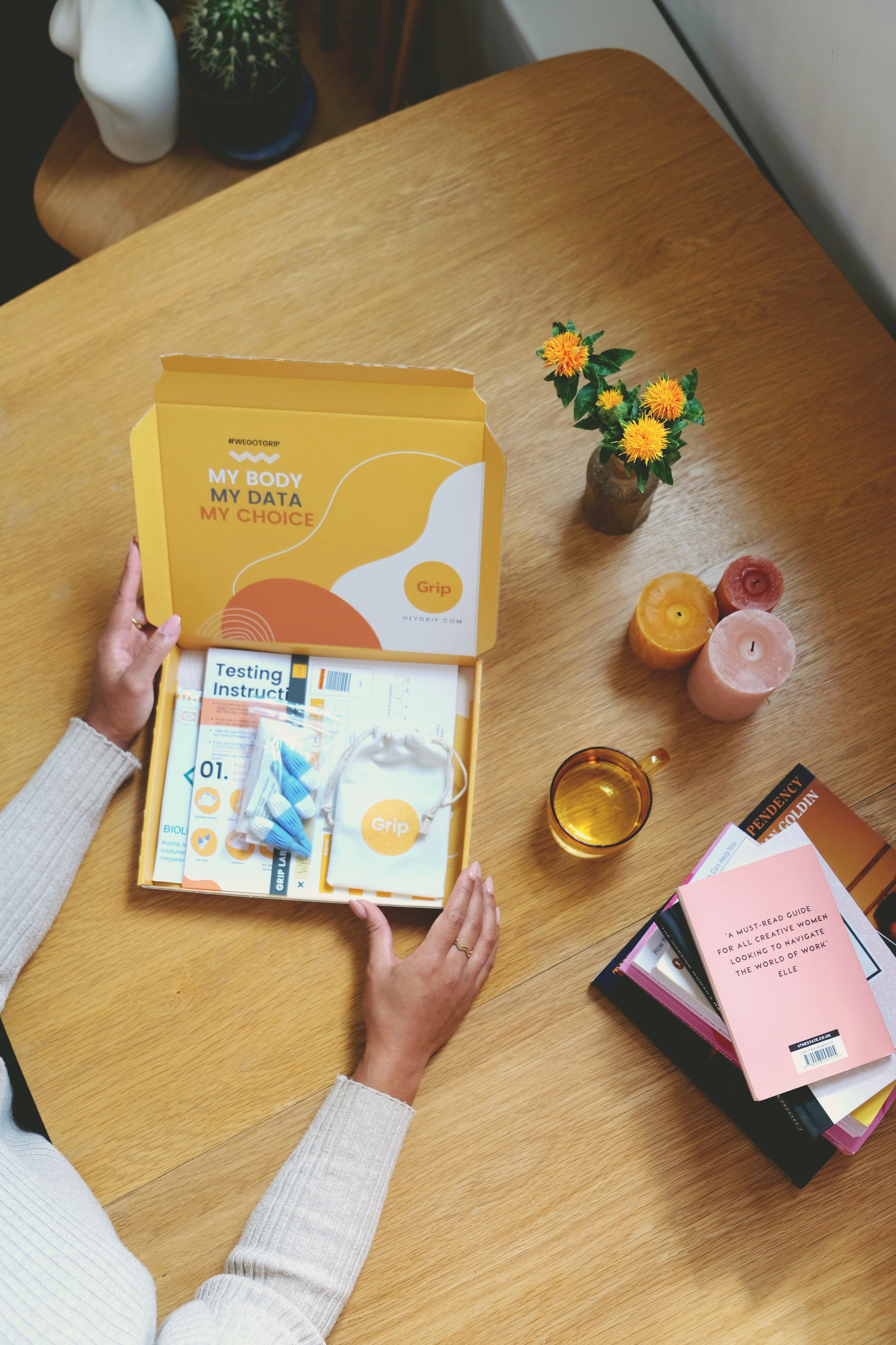
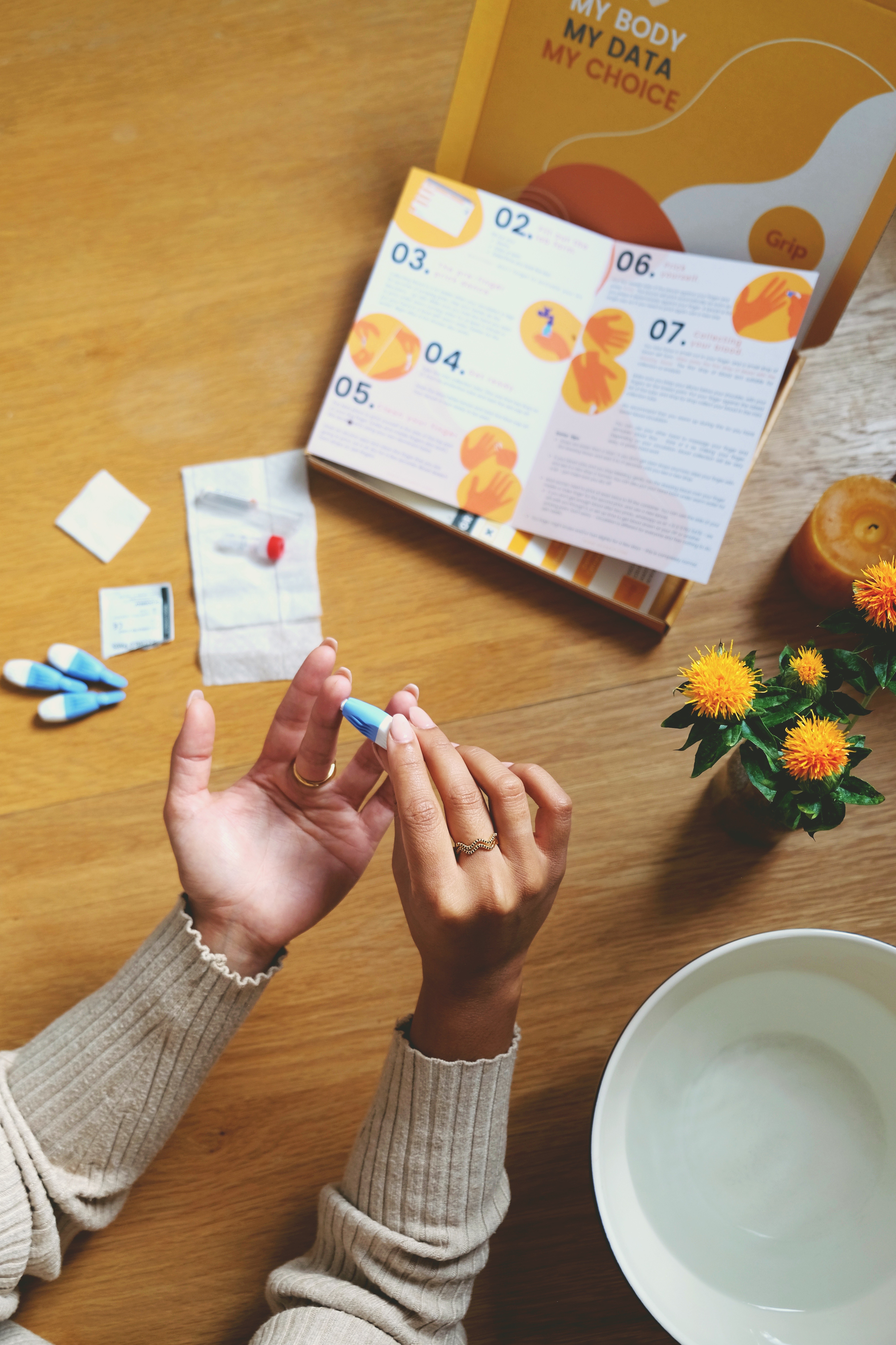
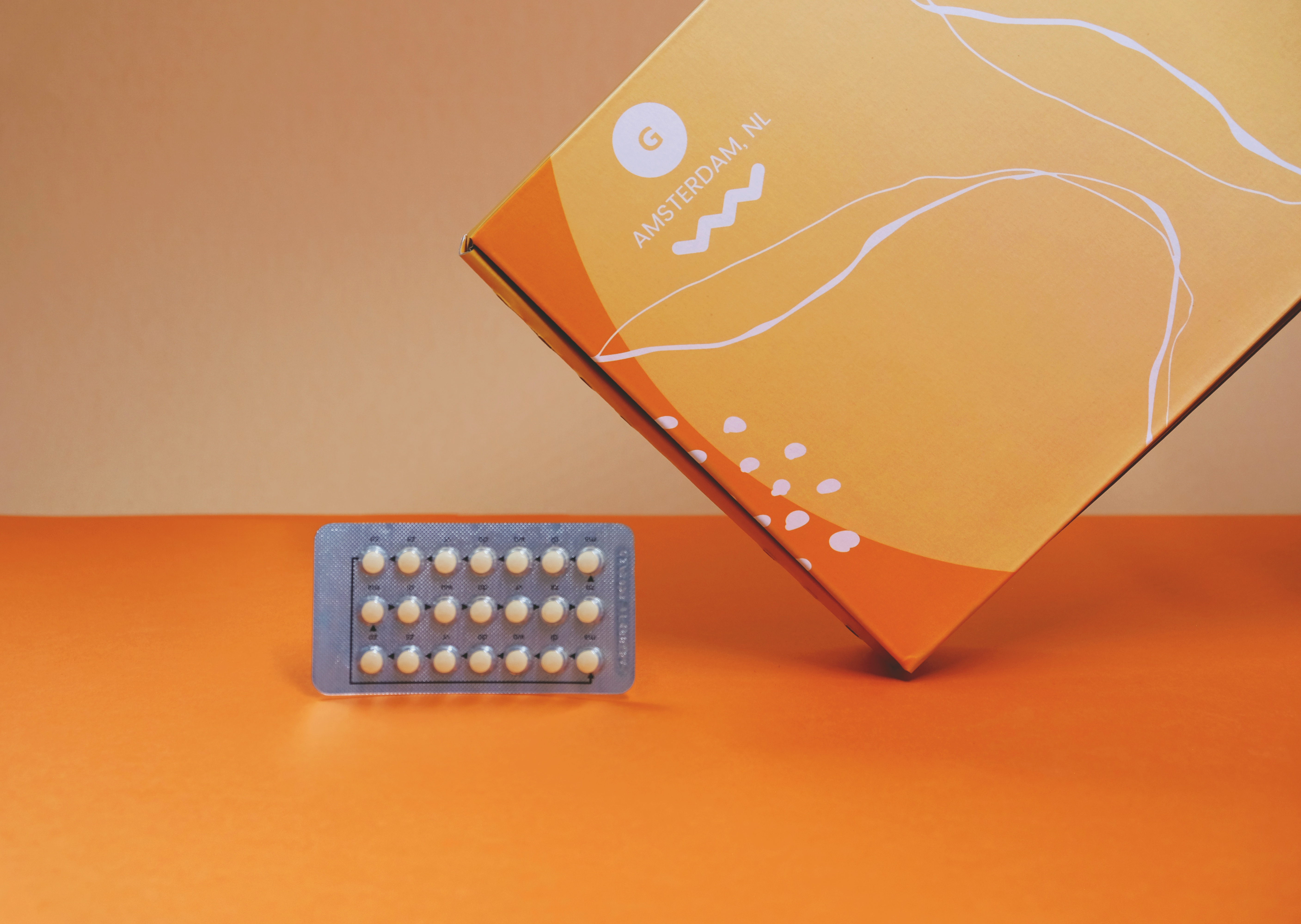
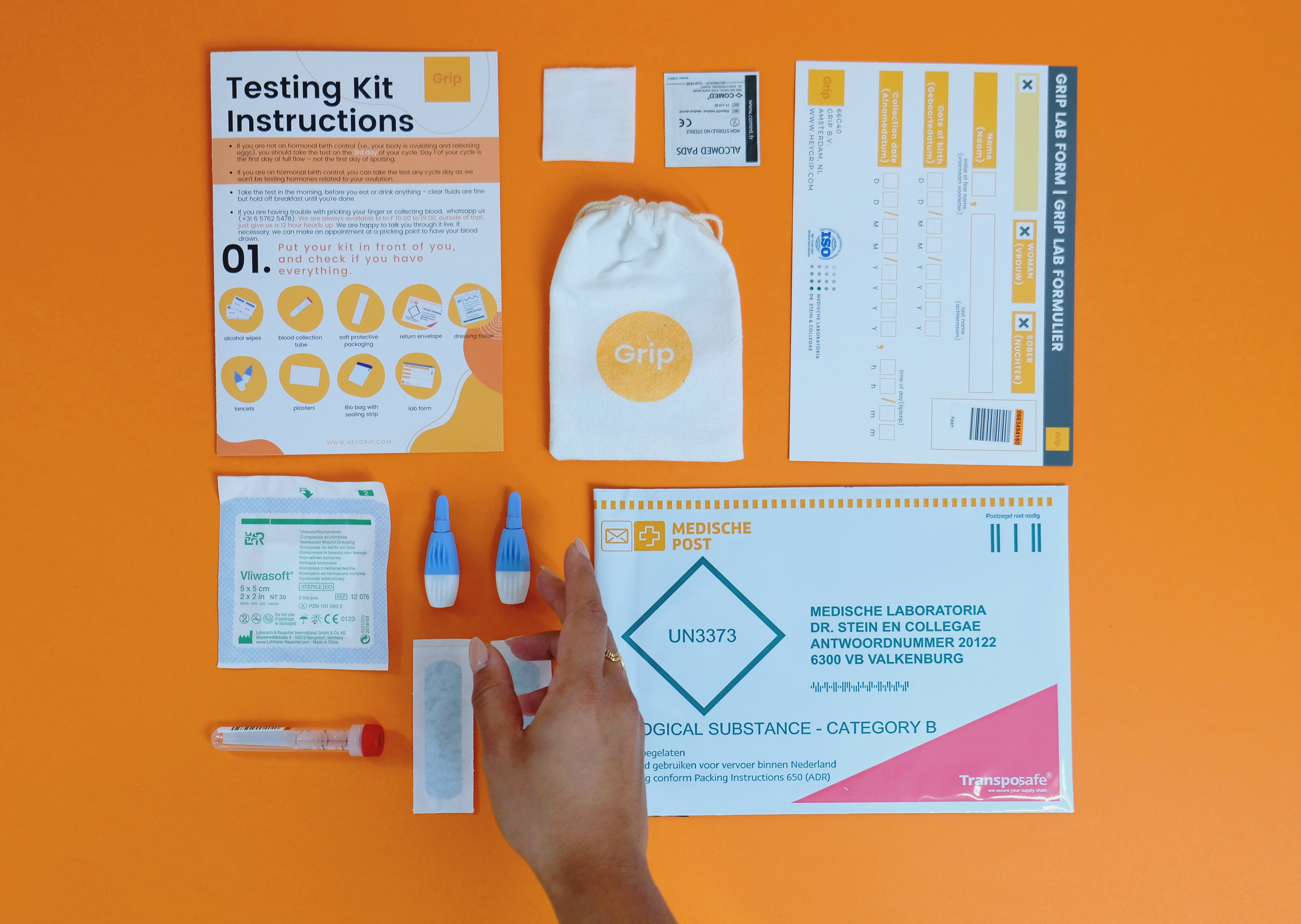
Grip offers people with ovaries a view on their personal hormonal & fertility health based on an at-home blood test.
Brand strategy
Background
The initial brand and website were created by our co-founders, both with no design background. When I joined Grip, I took ownership of the website and brand. My goal was to create a more cohesive brand that resonates with our target audience with limited time and resources and iterate as we go.
The initial brand and website were created by our co-founders, both with no design background. When I joined Grip, I took ownership of the website and brand. My goal was to create a more cohesive brand that resonates with our target audience with limited time and resources and iterate as we go.
Our customer personas:
- Anne Marie (29-35, just curious)
- Bete (under 28, worries about hormonal imbalances)
- Ling (average age 32, thinking about freezing her eggs)
- Marjolien (average age 30, currently trying to conceive)
- Kacy (over 35, just curious)
What problem are we trying to solve?
Our customers want to learn more about their bodies, plan for the future, and take actions based on their own personal status and goals.
Research
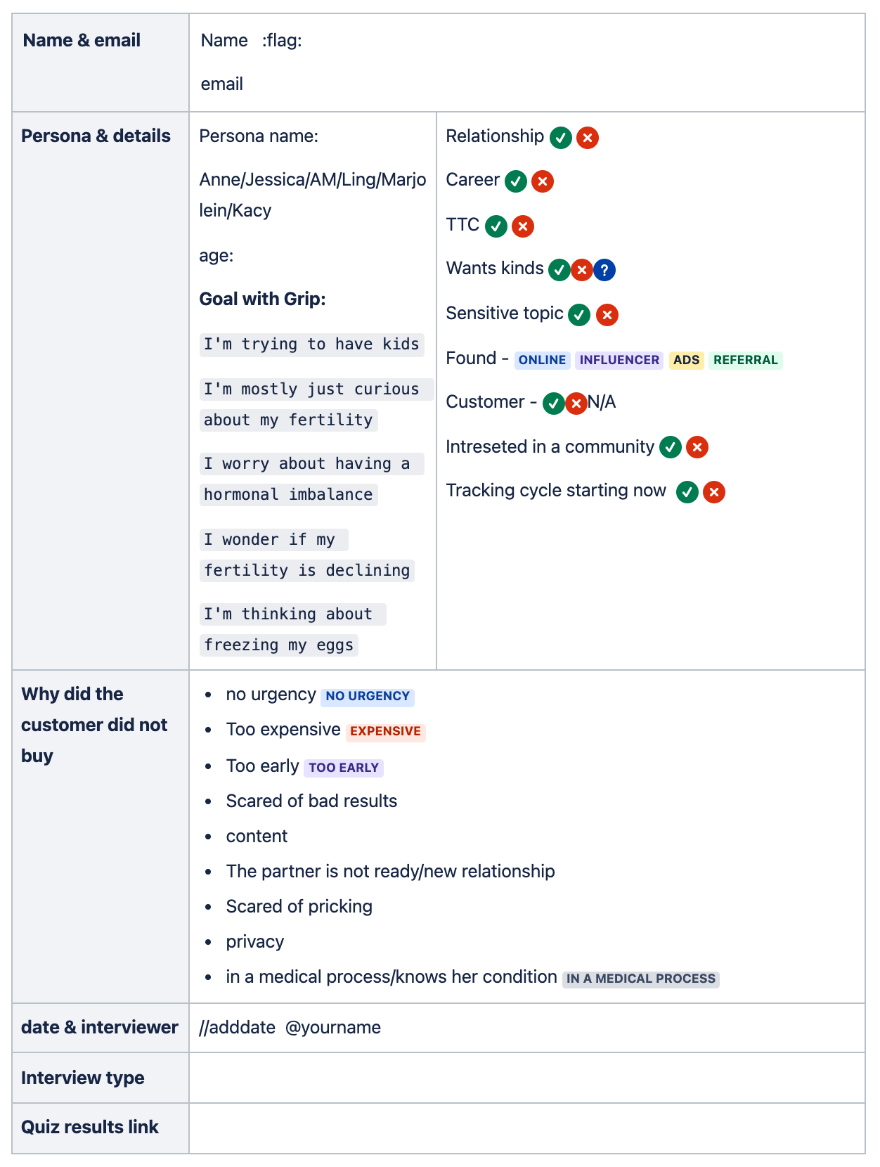

- create and overview of the existing user research, and analyzed the data that was available
- personally conducted over 20 end to end interviews
- created a user interview template used company-wide
- coached the team how to do research
- helped create the first customer journey map
- re-structure the customer personas
Brand guidelines
Positive
Transparent
Feminine
Human
We are not: Girly, Cute, Medical/cold, Too cool for you, Techie, White

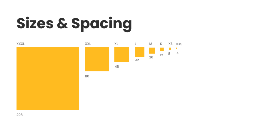

Color, size & typography
Goal:
Create a lean and basic design system for designers and non-designers to use across the product, website, social media, and print.
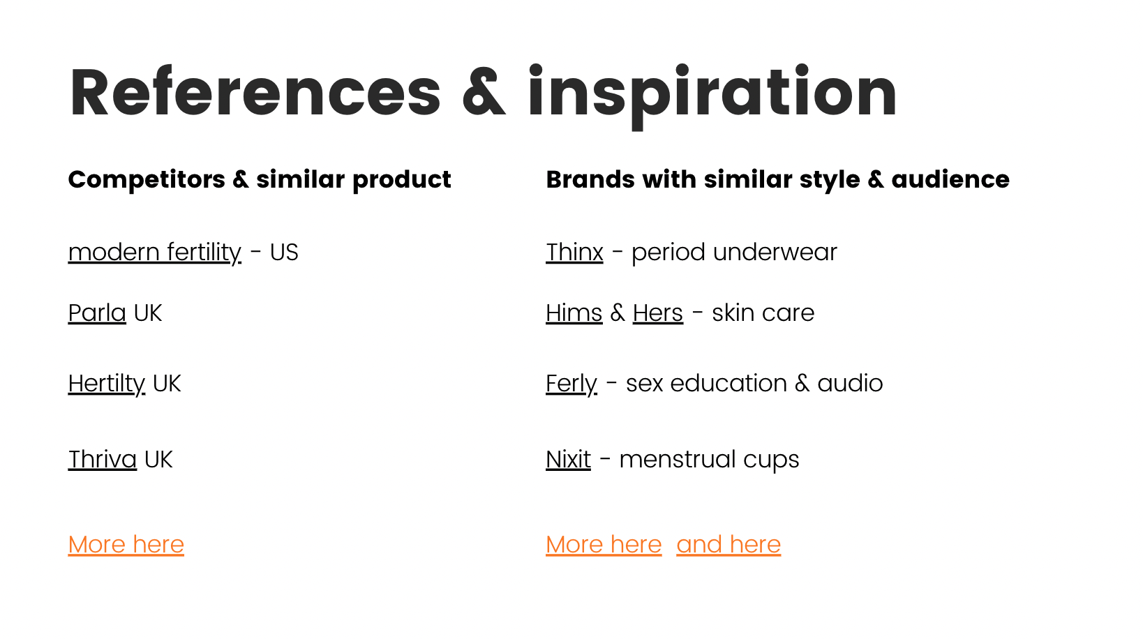

Competitor & trend analysis
Goal:
Create an overview and collect inspiration for product features, design style, and e-commerce patterns for Grip’s team and projects.
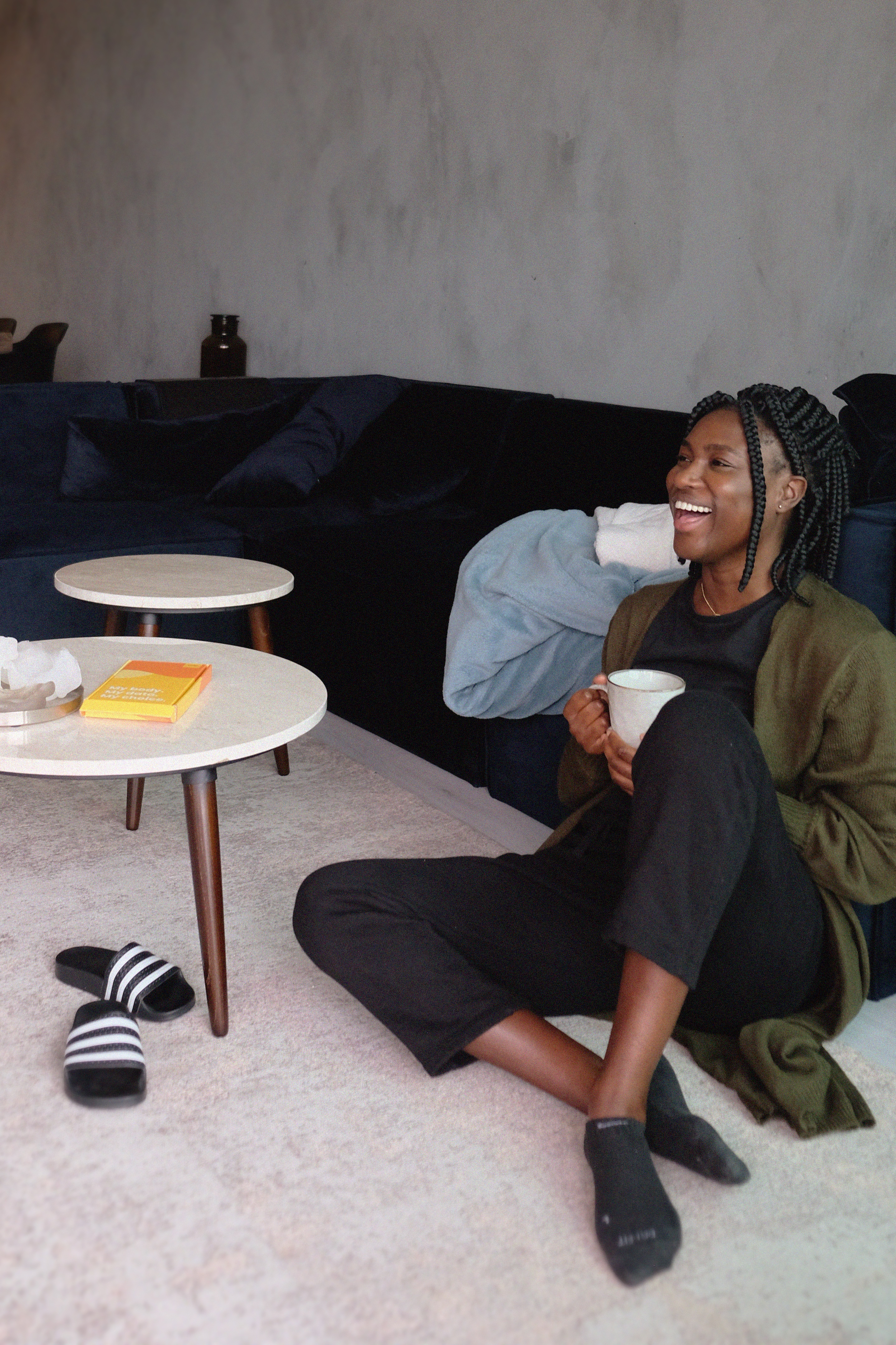
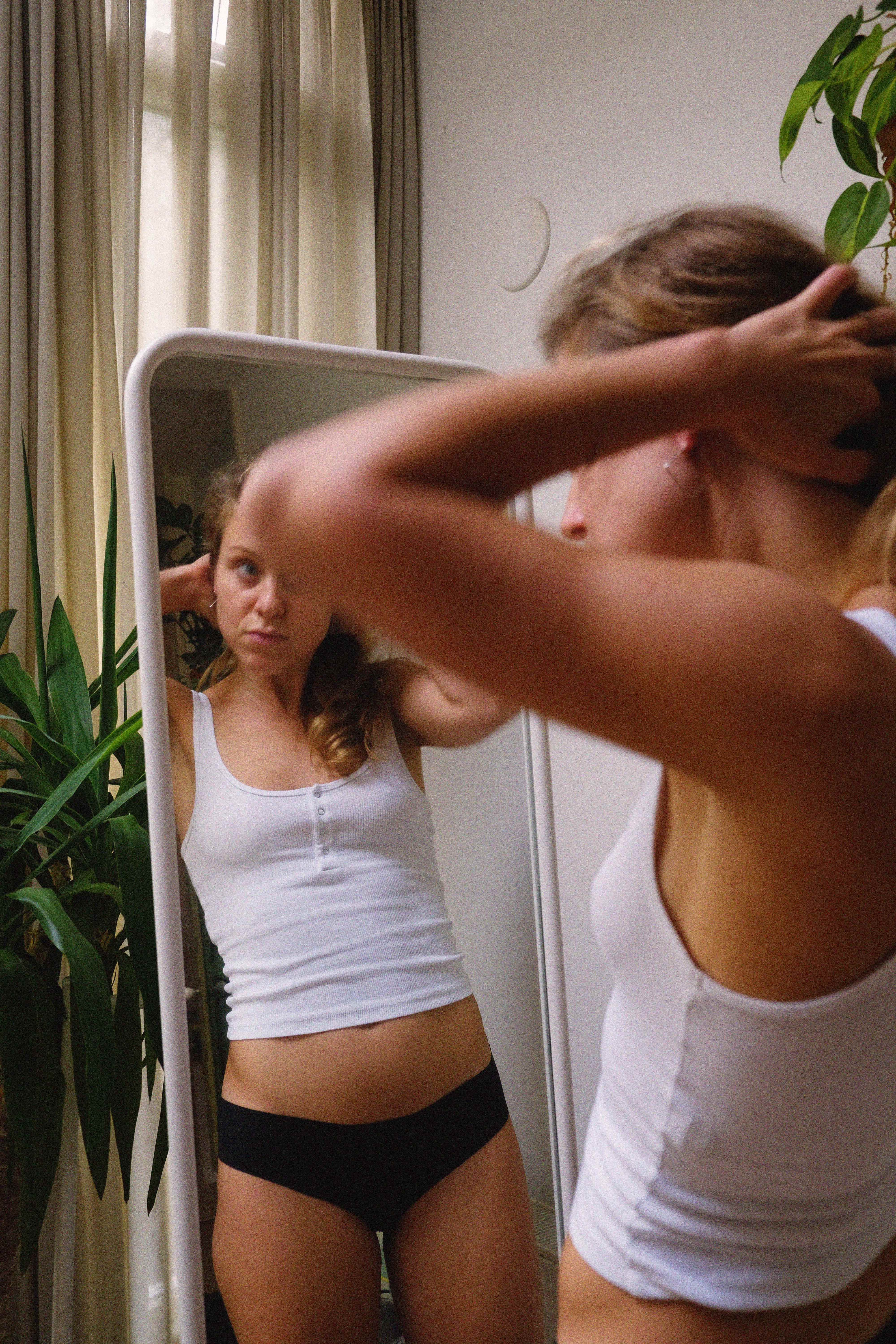
Photography
Website & Brand assetes
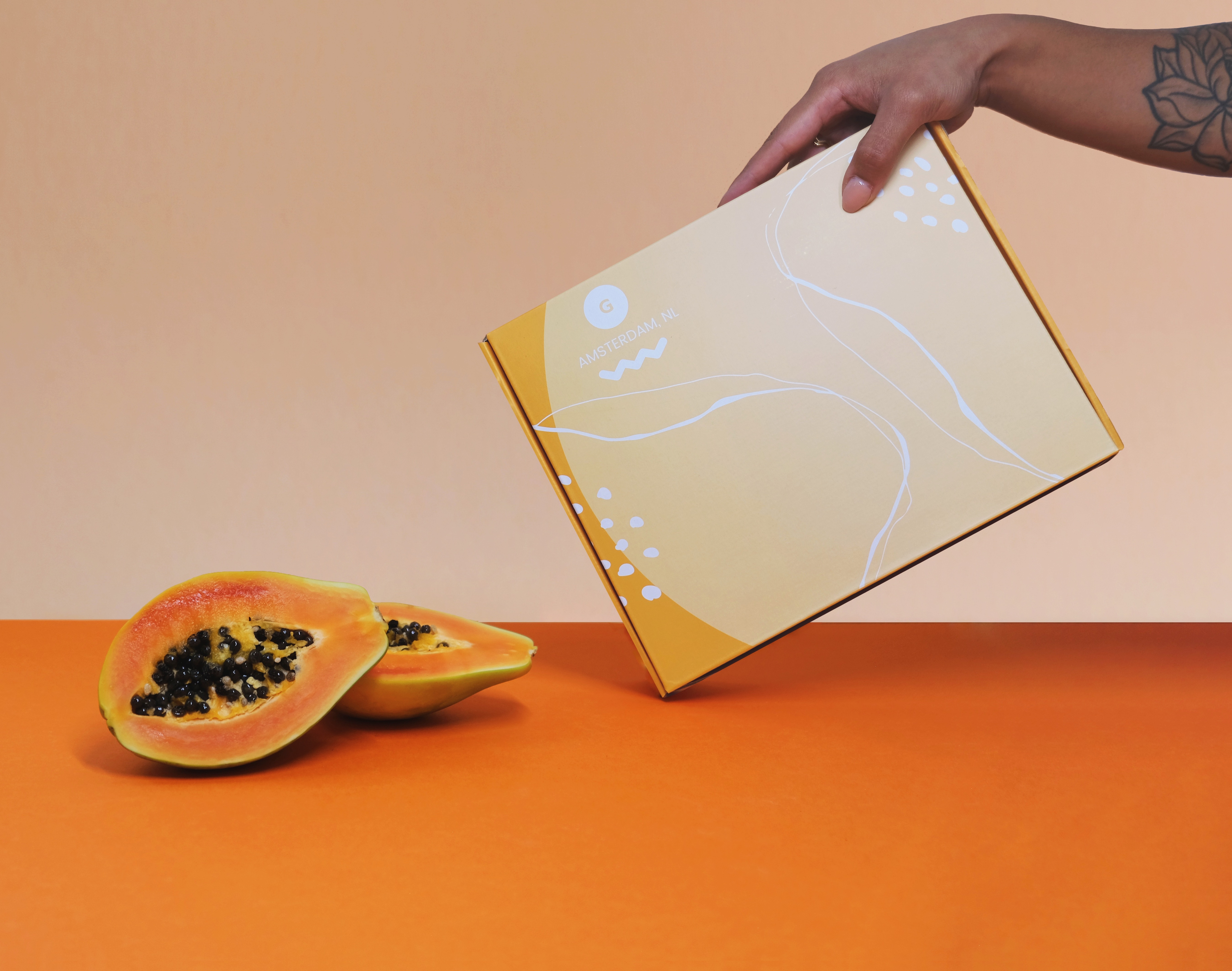
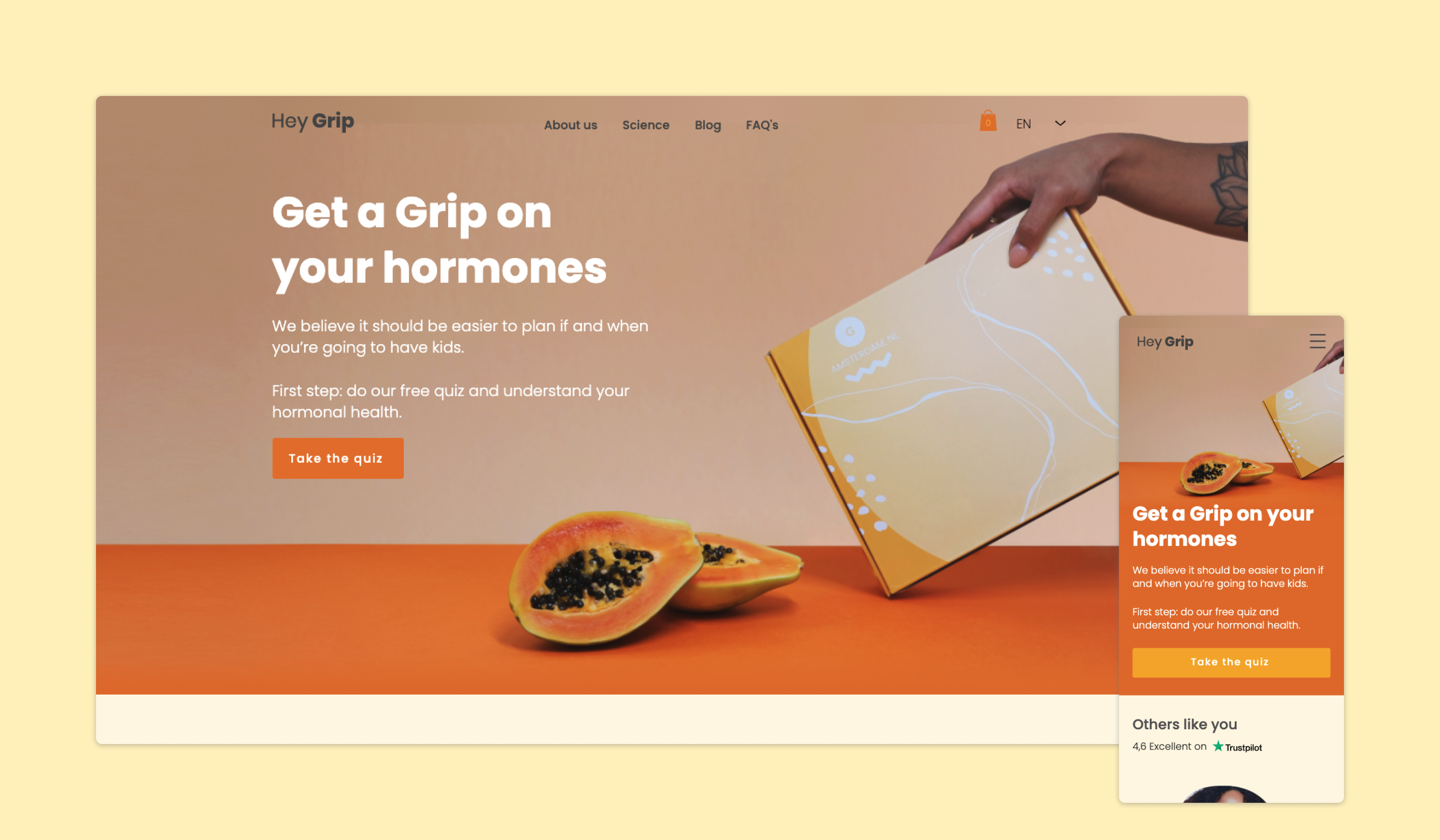
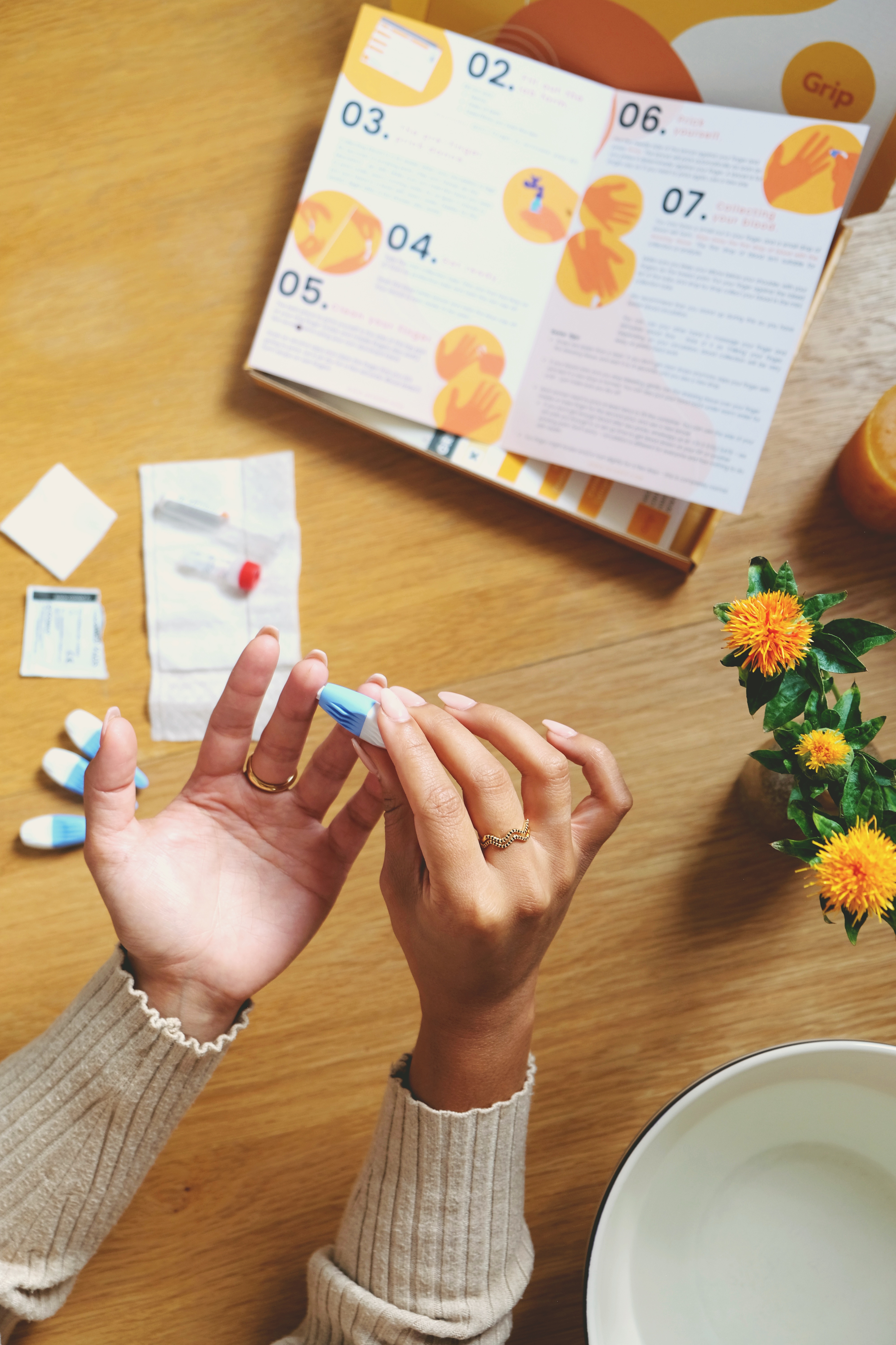
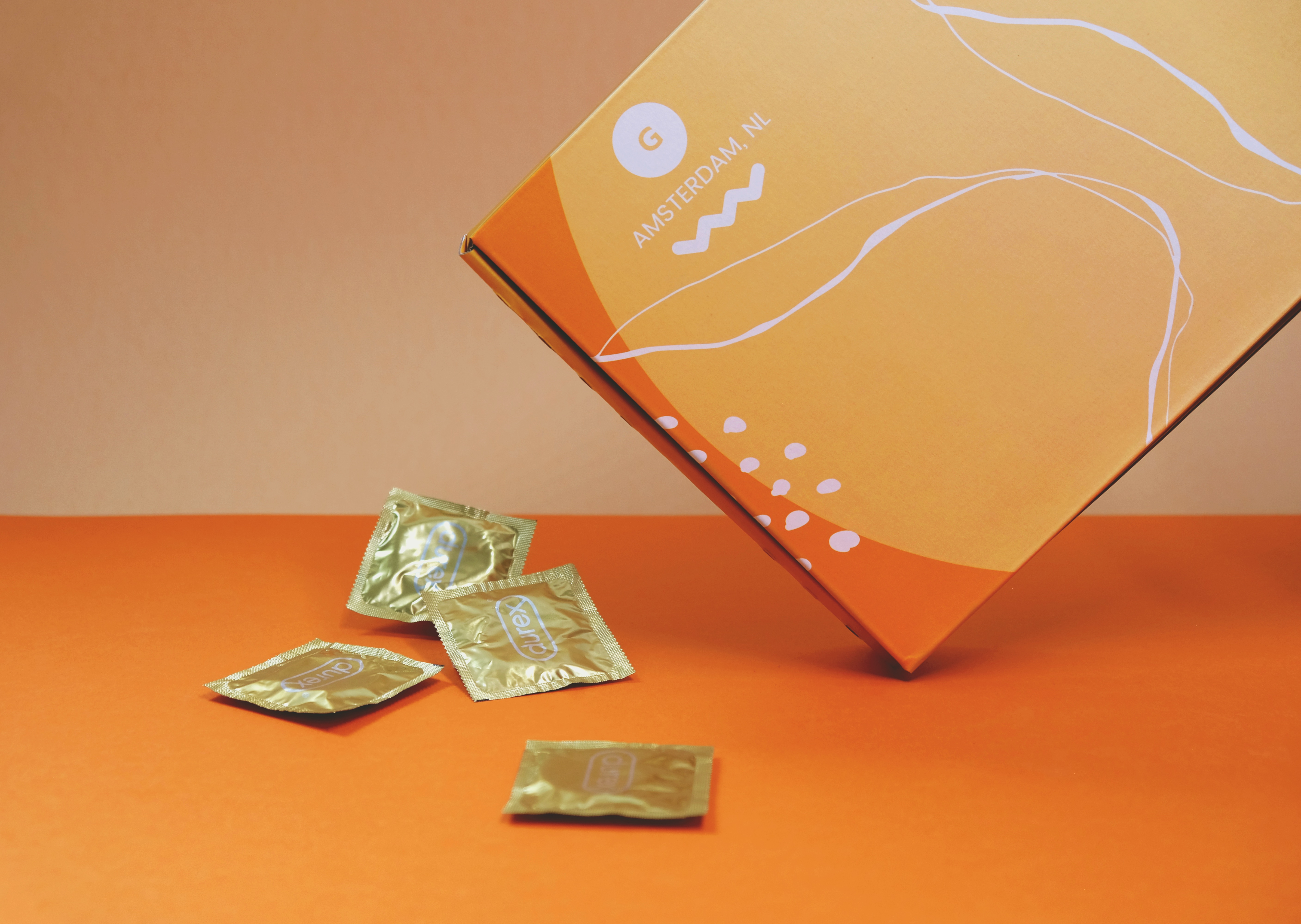
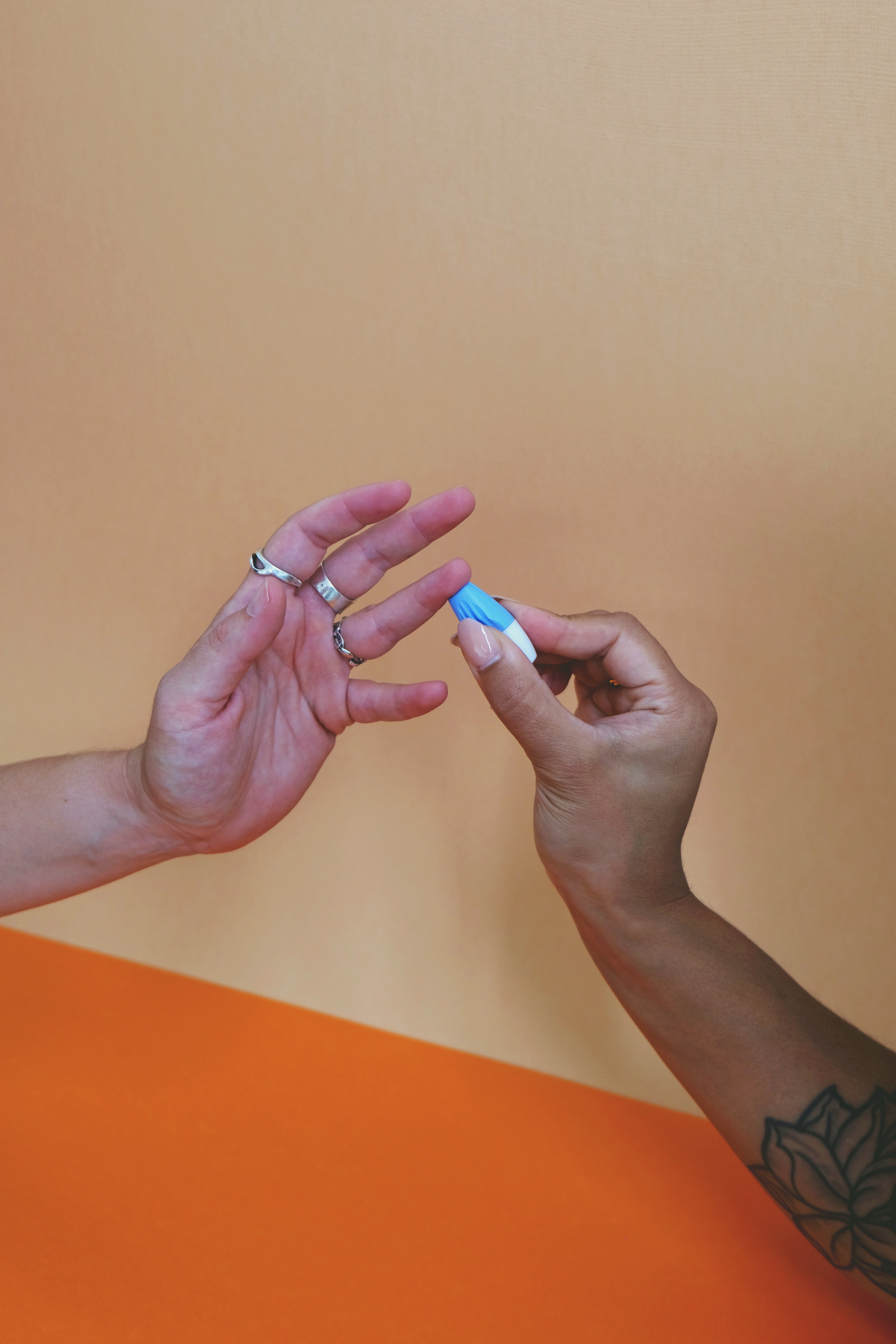
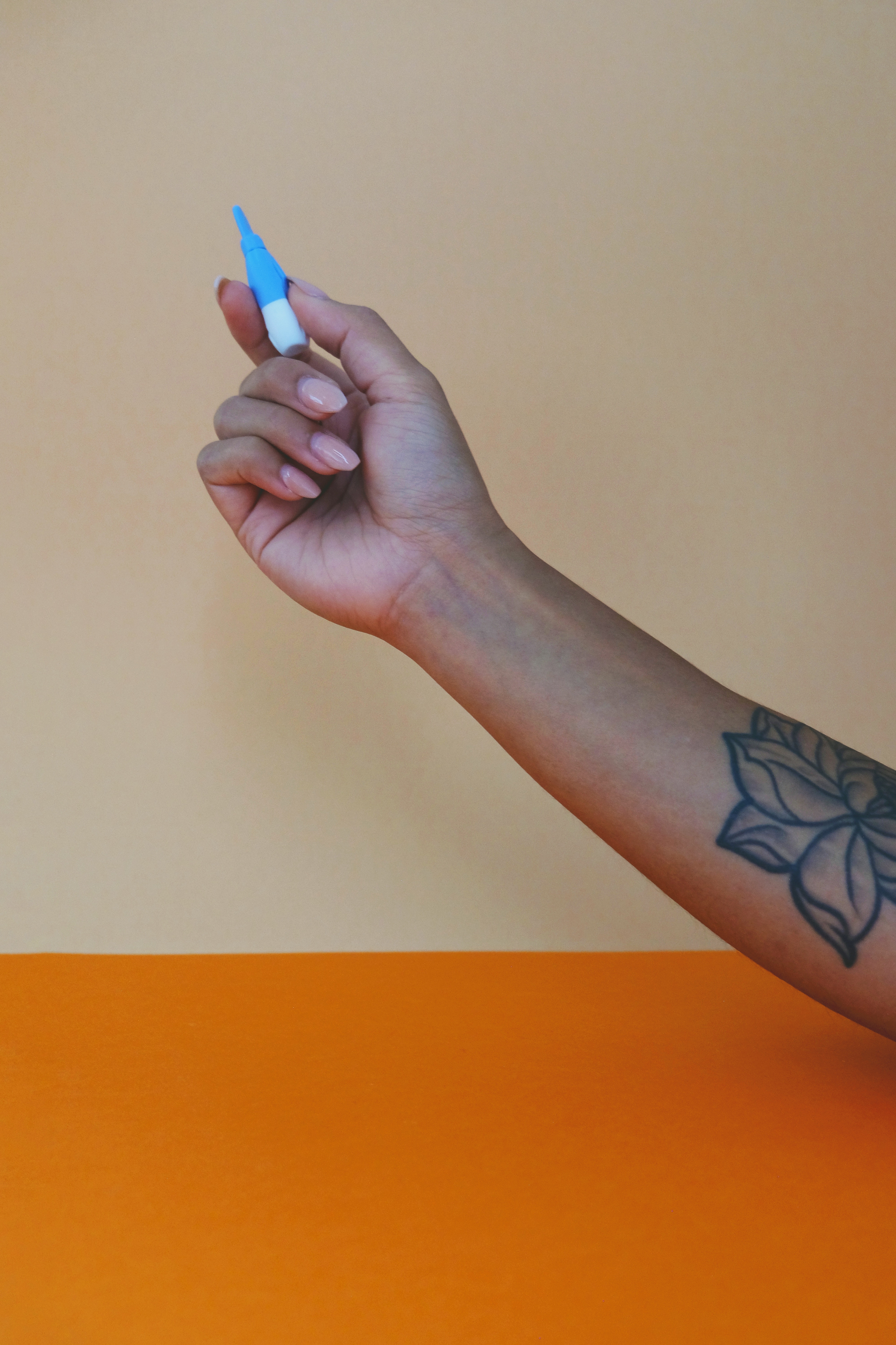
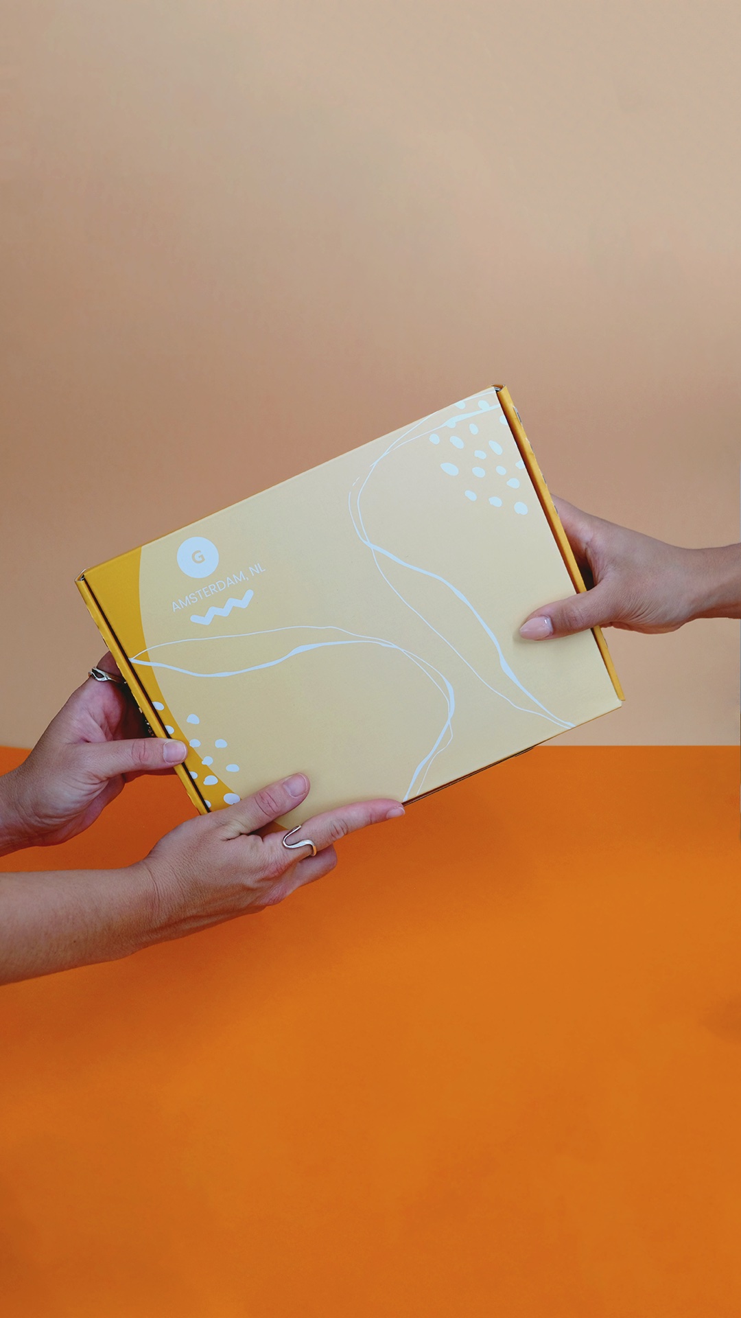
To save time and money, I took photos of the Grip kit. Together with the brand manager and social media intern, we created our own assets library.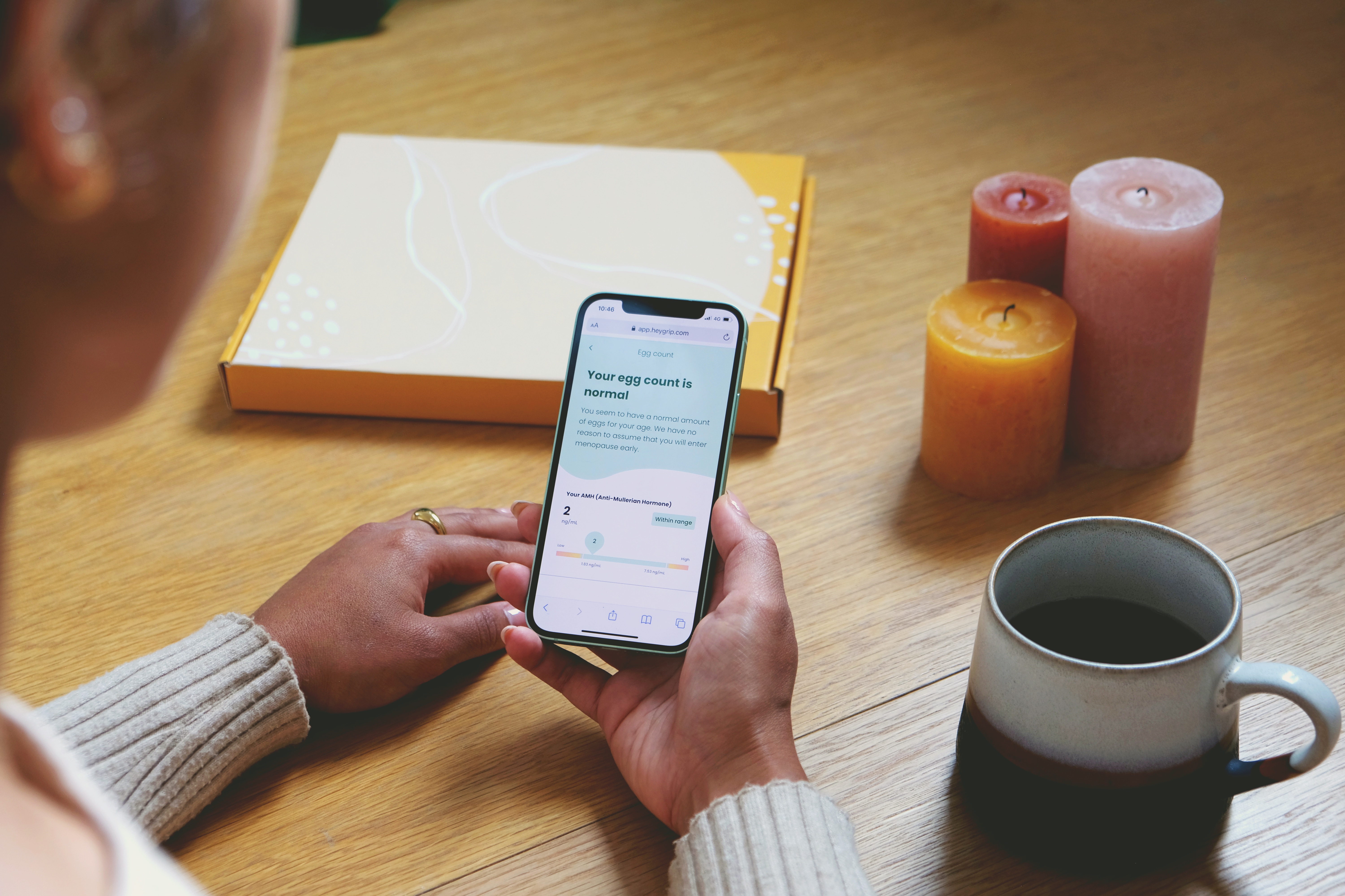


Grip - At-Home campaign


Website Design
Inital data
< 90%
of our users uses mobile00:01:28
Avg. Time on Page59.532%
Bounce RateOptimize the user journey
Started with these questions in mind:
- Why are people visiting our websites?
- Why and where are customers dropping off?
- Are we giving the right information to the right customers? to the right customer persona?
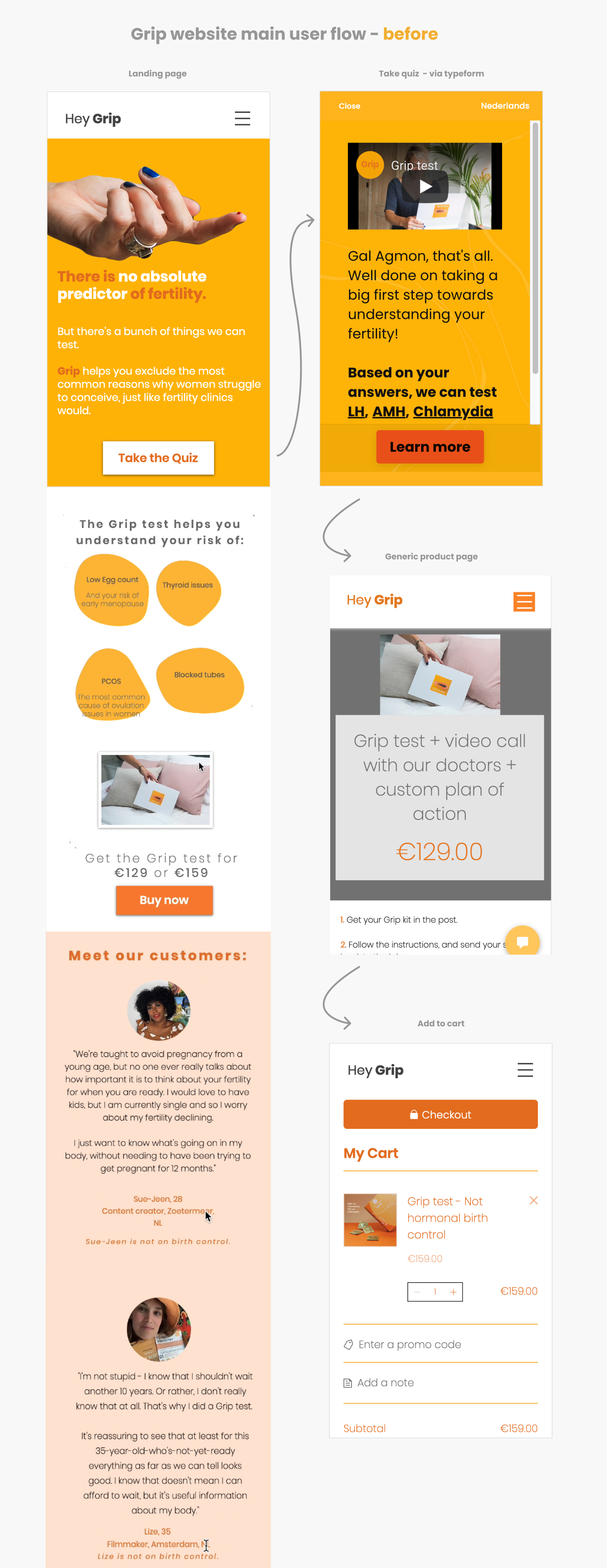
10 user tests - observe users exploring and purchasing
🧡 Positive feedback
👣 Next steps
🧡 Positive feedback
- clear copy, manage expectations
- like the style and tone of voice
- looks reliable - trust us.
- likes the idea of not going to the doctor
- likes the short explanations
- Easy to navigate
- Want to learn more before buying - how long does it take, what do I learn from the test, how does it work, what are the steps, is it all online? Want to learn what hormones mean..
- the difference in the prices is unclear
- basic design - not super professional
- bugs on mobile & tablet
👣 Next steps
- create a new page - about the process
- the landing page - customers don’t understand straight away what we test and what can we do with the test results
- at the end of the quiz - the results are not personal enough and don’t feel clear what to do now
- Buy page - the details and differences between the tests are not clear (intern)
- Science page - the most important information needs restructure (intern)
- Style improvement - spacing & alignment, button style, images (continues)
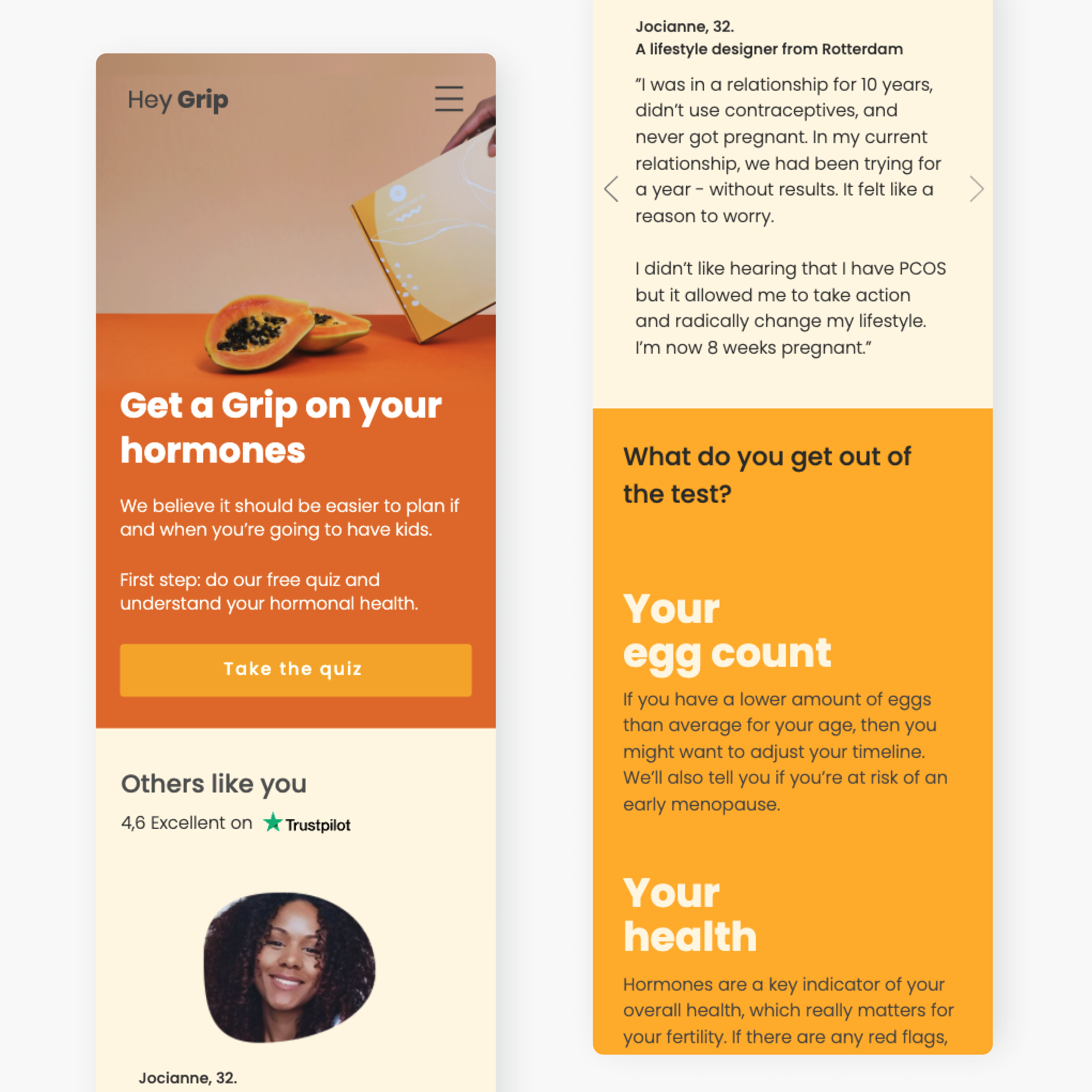
Landing page
We had a few iterations on the design and the copy based on user feedback, hotjar heatmaps, google analytics, and screen recording.Actions
- create a brief for copy changes (what to clarify, missing info, shorten inf..)
- change sections - emphasis on testimonial and founder sections
- increase the number of users that click to take quiz button.)
- optimize performance with WiX's limitations
- optimize buttons and mobile experience
Landing page improvements metrics
25 May 2021-26 Aug 2021 VS 20 Feb 2021-24 May 2021
Bounce Rate
- 36.52%
35.65% vs 56.16%Avg. Time on Page
- 15.39%
00:01:02 vs 00:01:13Overall Avg. Session Duration
+5.89%
00:01:19 vs 00:01:15*usually we want avg time on the page to increase, but with the decrease in the bounce rate, more users are clicking the links and viewing more pages on the website. So we were happy with the results.

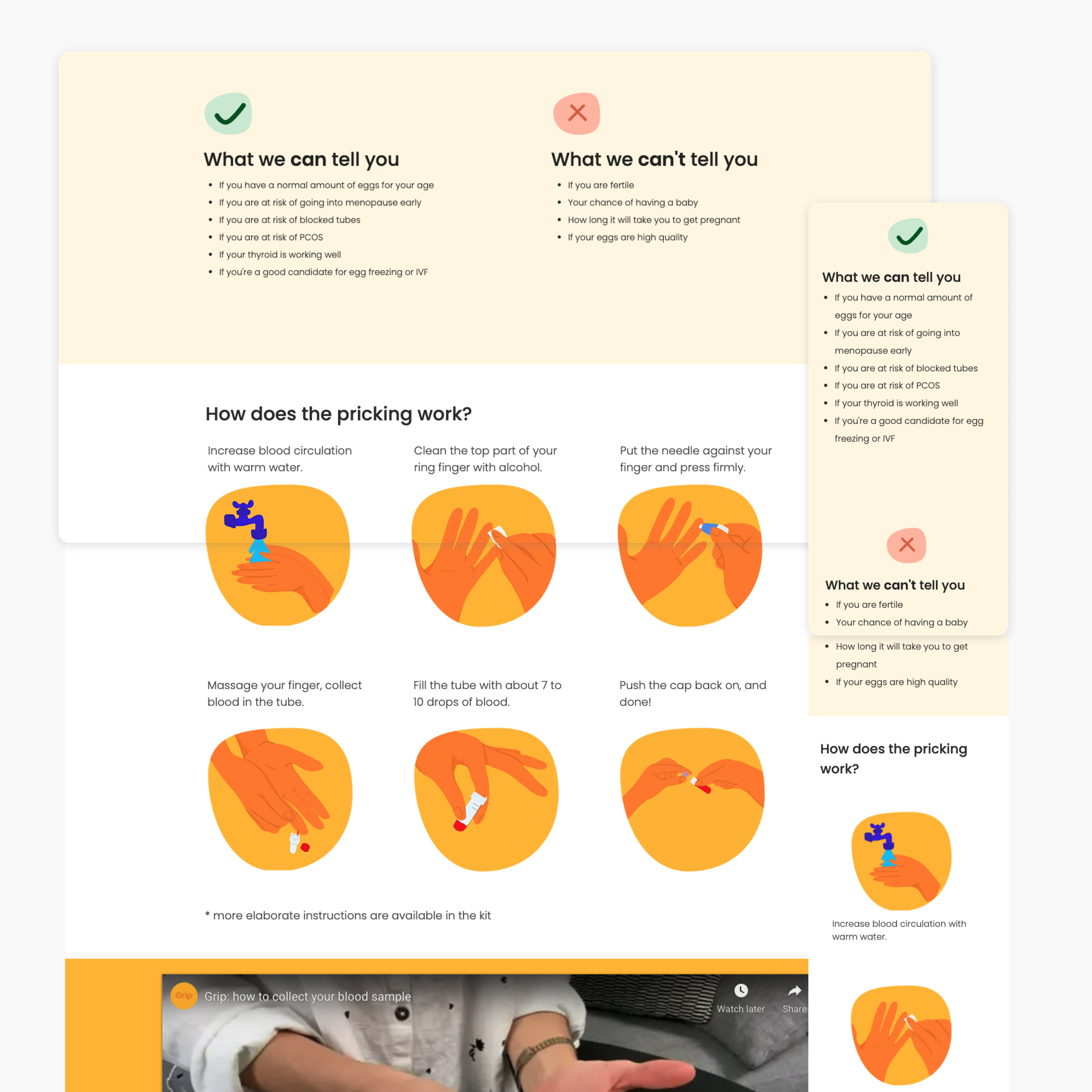
New page -How Grip works?
Based on user’s feedback, we add this page to gather the most important information that customers were looking for:- the process and timing
- What we can & can’t tell you
- How does the pricking work?
Check out the page on the website
Within a week, the ‘How Grip works?’ page became our third most visited page.
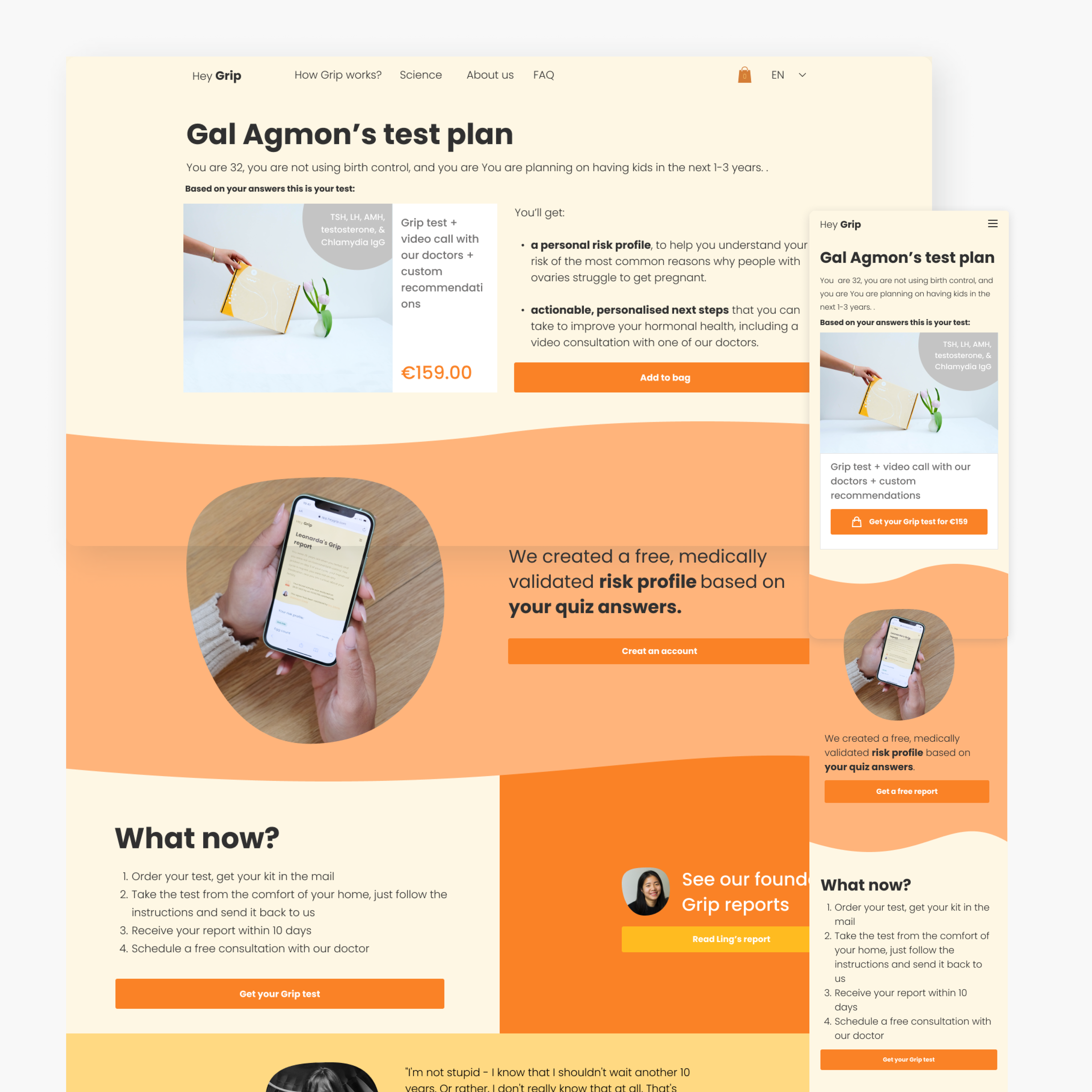
New page - Personal plan
The problems:Users are not converting after the quiz because of:
- Lack of urgency
- Lack of information
- Don’t see the value for money
- The quiz is not optimized for mobile + bugs
🧡 Positive feedback
- overall quiz impression - facts were nice - educated and reference
- the funny tone - we explain why we ask questions
🤓 Improvements
- starts and want to know the process and goal
- wanted to see what they will get, was disappointed by the last page that is not personal to them
- Still have a lot of questions:
- if I get bad results - what actions can I take after?
- what are my options
- want more information
Personalized plan page vs old generic product page metrics
Bounce Rate
- 45.23%
30.35% vs 75.88%Avg. Time on Page
- 60%
00:00:31 vs 00:01:33* The decrease in the bounce rate, more users are clicking add to cart
Success metrics
1 Apr 2021-31 Oct 2021 VS 30 Aug 2020-31 Mar 2021Website Avg. Time on Page
+ 21.47%
00:01:47 vs 00:01:28Website Bounce Rate
- 16.88 %
49.49% vs 59.53%Implementation